The Story behind the Panel |
|
Pink Angel |
|
Pink Angel - full panel |
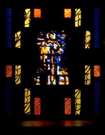
In this case, The Idea. One of the first ideas I had when I first saw Photoshop (in 1991) came when I saw the CMYK 'channels' and understood the possibility of layering flashed glass in terms of the four color printing process. This panel was a result of that initial desire for some technical exprerimentation. That is, the center section with the the multiple layers of glass came first, then the framing section came later. In this version of the panel as a whole, I wanted to play with negative space, hence the large black areas.Some have commented how this photo looks like a full sized architectural piece, being surprised when they find out that the actual size is not even 9 inches wide by 10 inches high. It was not my original intention though I do like this illusion of size. I also like the abstracted figure, recognizable as a figure (to most people) but not distinct in detail. The scratchy looking red and orange pieces in the frame area is flashed red on yellow glass. The glass was coated with a liquid resist and allowed to dry, then the resist was scratched off with a needle and acid etched. The yellow pieces with black lines were originally one large piece of glass with a pattern screenprinted and fired into the glass. The dark blue (barely visible in the corners of the panel) is also screenprinted with a repeat pattern. |
|
Pink Angel - Detail of Multi-layered Central
Figure |
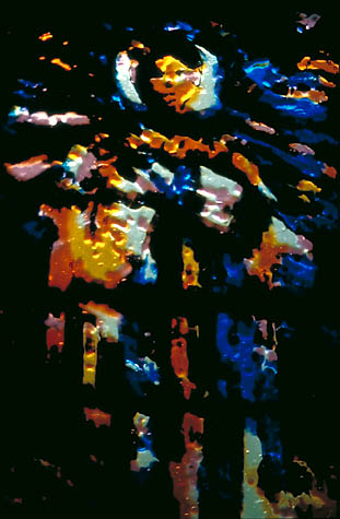
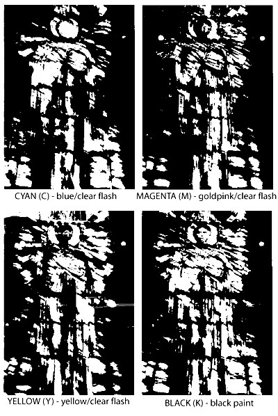
The Layers There are three layers of glass in this detail - one is a gold pink flash, then a yellow flash and a cobalt blue flash. The Black paint was screened onto the blue layer and fired into the glass. The sparkly nature of this particular version of the 'angel' comes from the gold pink layer of glass. This is because the glass is softer and the cutting of the blaster went deeper in the glass. After fire polishing, these ridges caught the light in a way that the shallower flash could not. So the gold pink layer of glass will catch light from much more acute angles. The predominance of orange comes when the gold pink and yellow layers overlap.
|
|
|
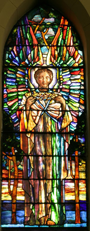
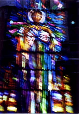
The Source Panel This is the panel of which I took a photo in 1992. from The Crown of Thorns |
|
the original photo |
The Source Photo This photo was taken in 1992 while attending a conference of the Stained Glass Association of America in Chicago.This was a window in one of the churches on the bus tour. At the time I made the panel, I didn't even remember from which church. I just remember I liked the wild eyed expression on the face of the figure. The photo is out of focus - a common enough plight in trying to photograph stained glass on the fly. But if you look closely, you might notice it's also double exposed. I had inadvertently rewound and shot over a roll of film that was in the camera. Hence, the double-exposure. It was a surprise, but I was really quite happy with the results. |
|
the computer print |
The Process - 1
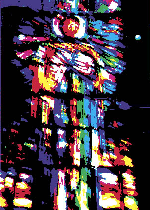
This is what the final color print, with the CMYK channels. |
|
Black and White Channels |
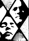
The Process - 2 These are the the black and white channels that represent the Cyan, magenta, yellow and black print colors and what translate into the different layers of glass. |
