February 22, 2005
Design process for a small panel
I am designing a small panel to be donated to an auction raising funds for a local arts organization, Art St. Louis. It's to be auctioned at a wine tasting event, therefore I'm thinking of a simple wine and grape theme. I begin with some thumbnail sketches for idea generation.
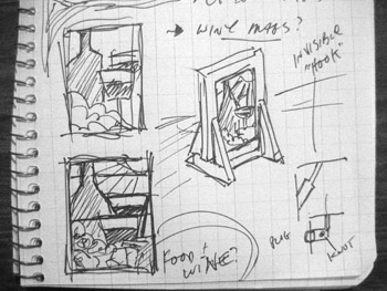
The first sketch of any kind was done in my journal.
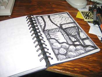
The next drawing, larger though not necessarily full size, was drawn in one of my sketchbooks. I keep anywhere from 2-5 sketchbooks going at any one time. I currently have 3 going - one larger, one smaller and one strictly for color drawings. This is in the 'smaller' sketchbook - the area for the drawings being about 4.25" x 6.75". I'm seeing the final panel as larger than that - about 7.5" x 10" or thereabouts. This being an autonomous piece, I'm not bound by any specific size. I'm thinking of it being a painted panel using nice antique glass, and one that might be put in a window or placed in a stand.
This happens to be the first sketch I drew in the sketchbook - I like it fine and think this is what I would like to go with. And yet I can't help that one drawing is not enough. So, to be sure, I did some other sketches, none of which I like as much.
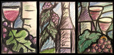
Other drawings (done in the 'color' sketchbook) - But I still like the first one the best.
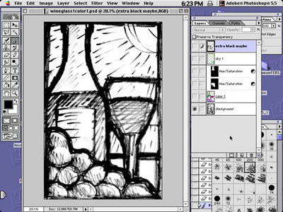
---- After scanning it, I bring it into Photoshop.
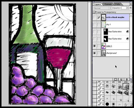
---- The first layer gets color.
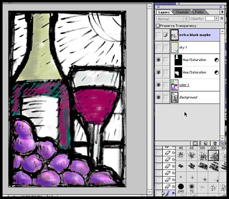
---- Then I do some minor color adjustments. I'm already starting to think of glass, the area in the bottle with the wine being perfect for some smaller scraps of gold pink English streaky that I've had for years.
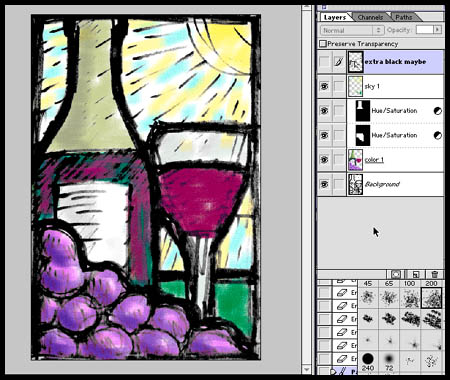
---- Then the color for the sky goes in on a seperate layer. I'm thinking of a light tint with flecks of silverstain for the sky. Perhaps enamels, but maybe not. Again, this may change when selecting glass. I might also try 2 different backgrounds, as there are not many pieces in this panel.
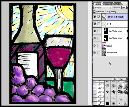
---- I then add black in a seperate layer to firm up the composition and add some break lines. Especially breaking up the 'wine' in the bottle to make sure I could use those nice but small antique english streaky scraps that I would like to use. If this were a commission I would print this as a color sketch and present it to the client.
Then I extract out the black and make into a bitmap file. This is the end of the Photoshop part of the process. Now the bitmap file gets imported in Illustrator. Basically, I use Illustrator as a CAD program. There are many designs that I do directly in Illustrator, especially larger works. I made the decision many years ago to go with Illustrator over an architectural CAD program (such as PowerCad or ArchiCad on the Mac or AutoCad on the PC) because the tools in Illustrator tend to lend themselves to more creativity. At least that's how I see it. I've never regretted the decision, other than the odd feeling I have from knowing I may be the one and only person using Illustrator in this way. I certainly have never heard of anyone else using Illustrator to design stained gass windows. I do know there are plug-ins available that will broaden the tools in Illustrator to make it into a more conventional CAD program. I haven't found I've needed them.
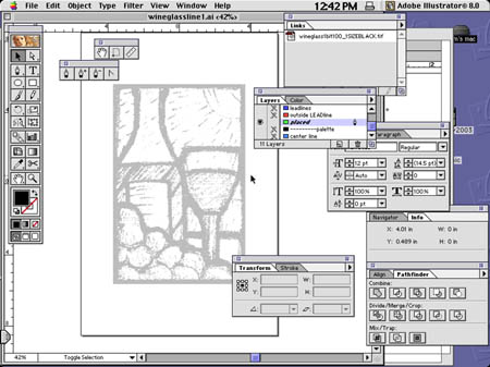
---- I place the bitmap file into a new layer in Illustrator, and dim it 50 percent.
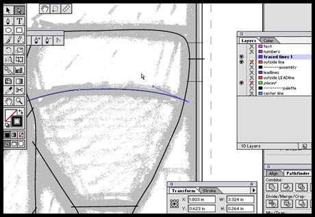
---- Then, using the pen tool, I 'trace' out where the leadlines will be.
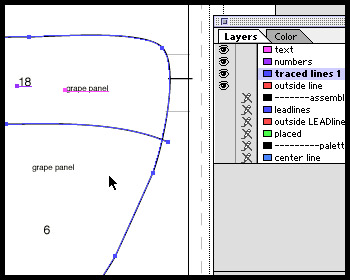
---- I then number and label the pieces. On a panel this size the whole process in Illustrator might take 20 minutes at most.
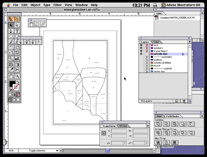
---- The pieces are ready for printing.
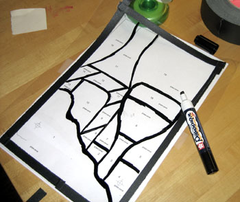
---- After printing the paper copies, I trace out the leadlines onto a sheet of acetate with an opaque paint marker. You might notice I have already made one small change. The wine glass is now going to be clearly in front of the wine bottle. It seemed to me too uncertain in the design after printing it out.
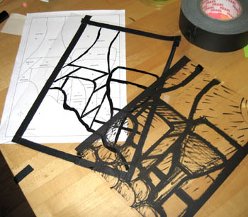
---- The other transparency is one printed from the Illustrator file with the placed bitmap included. This I use to select glass intially.
Next phase - Glass selection and painting...
Posted by Tom at February 22, 2005 02:49 PM