March 21, 2005
St Francis Xavier (College) Church
Quick look today inside St. Francis Xavier (College) Church, at St. Louis University.
All the windows are by the Emil Frei studio, out of St. Louis, done in the 1930s. The windows are a straightforward gothic revival (american version) style, with mostly standard figural scenes. The tone of them almost suggests grisaille, for there is a good amount of white. The main exception being the large piece behind the altar, which is in bright vivid primary colors, almost coming off as abstraction from a distance. That one was impossible for me to photograph.
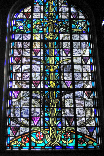
The most interesting windows were tucked in out of sight in the transcepts. One is this tree window which has in interesting mix of painted grisaille (the vines and leaves) and standard mosaic style (tree trunk and grapes). This is in the South transept, facing the altar.
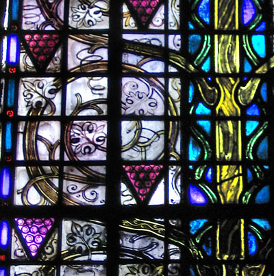
This detail shows the grisaille vines and leaves better.
This is in the North transept, facing the altar.
Offhand, I like this one the best in the whole church.
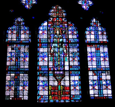
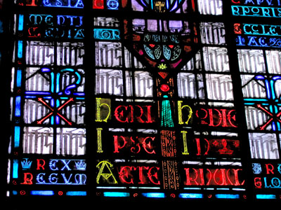
Looked at more closely this looks to be all text, albeit with a lot of repetition. I like this idea. Not sure what that main character set in the quarries says.
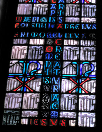
I can't help but think - what if this featured all readable text - wouldn't it increase the interest of the window as a whole? Is it simply a matter of making it in English rather than Latin? But I'm not sure I'm even catching what the Latin words are most of the time. Funny how this is an issue that this artist shares with graffiti artists. Artistic style or readable content?
