June 05, 2007
'Alice in Wonderland' - a study in translation
I saw a postcard of this Mad Hatter panel a few years ago and always suspected it was part of a larger program of panels. Indeed it is and the full Alice in Wonderland Window can be seen as part of the website for the church where it's located - All Saints Church in Daresbury, England.
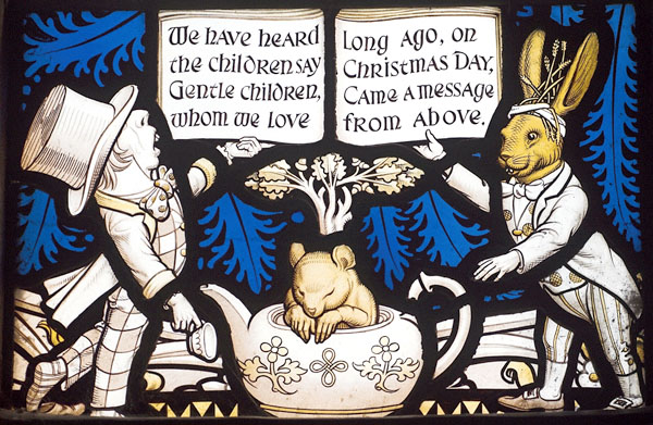
SG photography by John Eastwood
It turns out that the Mad Hatter panel is in the center of 5 small 'Alice character' panels below a larger Nativity scene.
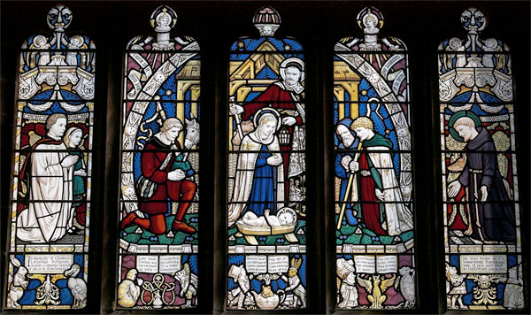
The window was created in 1935 to mark the 1932 centenary of the birth of Lewis Carroll and was created at All Saint's because it was the parish where Carroll was born (as Charles Dodgson). Lewis Carroll and Alice Liddell are depicted in the leftmost lancet. The stained glass is by Geoffrey Webb, who was a student of Charles Eamer Kempe. Stylistically, especially as regards the nativity scene, that makes sense as Kempe tended toward this kind of color scheme featuring the starkly white figures with shots of color in the clothing and background. (Bio of Geoffrey Webb - scroll down about a quarter of the page)
The design for the all of the 'Alice in Wonderland" characters are, of course, based on the famous illustrations designed by John Tenniel. I thought it would be interesting to get a detailed look at how closely the original illustrations, designed by John Tenniel, were translated into stained glass.
Mostly pictures, with some written commentary - going left to right -
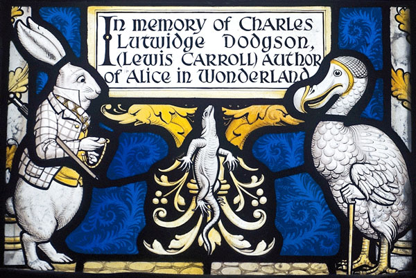
White Rabbit and Dodo Panel
The stained glass panel.
The original illustrations in full.
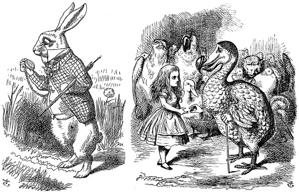
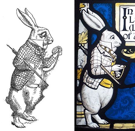
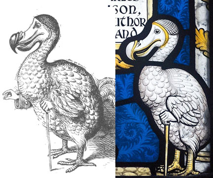
As expected, the stained glass figures have less cross hatching and feature more thick black lines. All the characters are surrounded by a fairly thick line of black. The translation to color is not jarring seeing that all the characters are on clear glass with accents in yellow silverstain. Keeping the characters all white against a dark color background gives more of the impression that the figures have stepped off the pages of the printed book. The yellow adds color which keeps them from looking too flat, yet the use of stain is subtle and doesn't overwhelm.
White Rabbit illustration and stained glass designs side by side
Dodo designs side by side
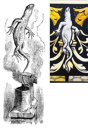
Lizard designs side by side
Caterpiller and Fish Footman Panel
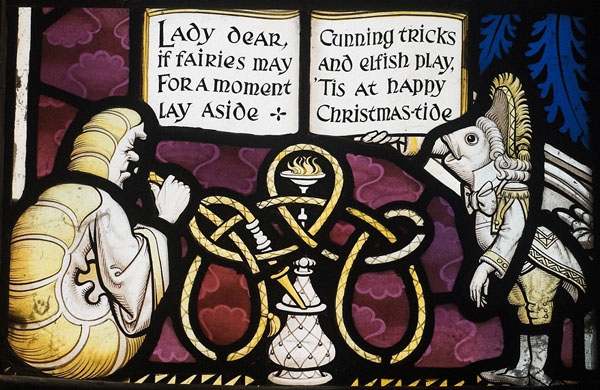
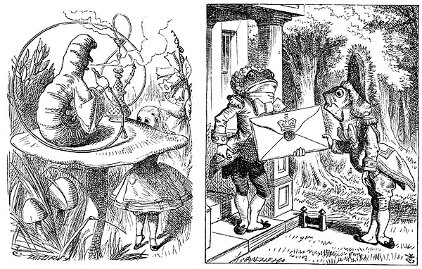
This example shows how the SG designer will sometimes take an element in the illustrations and transform it to something more conventionally stained glass like. I refer to the hookah pipe in the stained glass which, compared to the illustration, curves in a much more symmetrical fashion, much more like a decorative knot pattern one might find in a stained glass window.
Fish Footman designs side by side
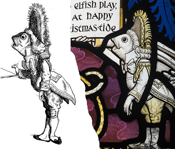
Throughout, the hands are proportionally larger in the stained glass figures and more clearly delineated. They are also, to my eye, more noticably 'human' hands. The hands are human in the prints as well, but the hands in the prints are smaller and sketchier, not calling attention to themselves as much. The Frog Footman is a good example.
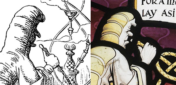
The caterpillar is unique in that the SG designer sees fit to delineate a face where there was only a shadow in the original illustration.
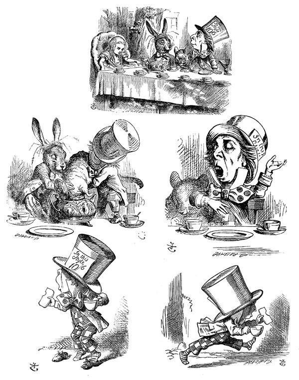
Mad Hatter, Dormouse and March Hare Panel

The Mad Hatter is the one character whose design does not derive directly from any of the Tenniel illustrations. It's curious since the Mad Hatter is depicted five times in 'Alice in Wonderland', more than any other character save Alice herself.
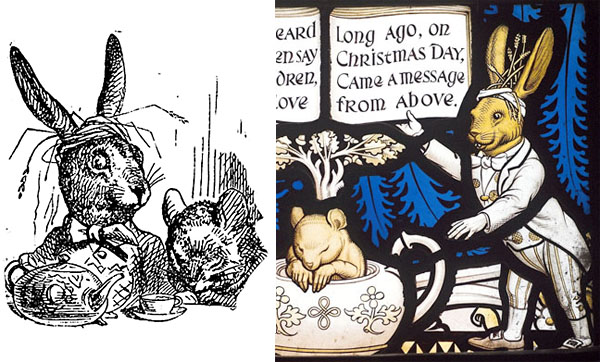
The head of the March Hare is derived from the main tea party scene though the Hare's body is original to the stained glass. The dormouse is roughly taken from the main tea party scene, though again the SG designer makes the hands larger and curiously more realistic human-looking hands.
Duchess, Griffin and Mock Turtle Panel
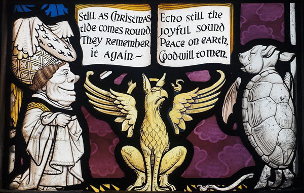
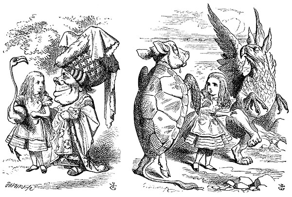
Note that only the head of the Griffin is derived from the above illustration(reversed) while the design of the body and wings of the griffin is new to the stained glass and again are more 'stained glass like, note the symmetry. The wings, especially, look more like Kempe than Tenniel.
Duchess designs side by side
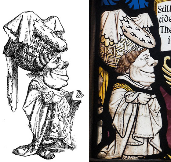
Mock Turtle designs side by side
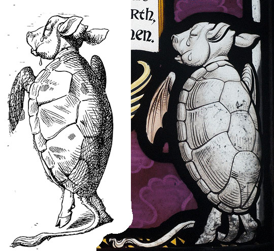
Note the linework. Both are beautiful in their own way but they are different interpretations. Both are, in fact, translations of an original design by Tenniel.
Many assume the original illustrations are pen and ink drawings by Tenniel, but they aren't. In the printed version, the linework was interpreted by the wood engraver, in this case by the Dalziel Brothers. Tenniel drew in pencil on a whitewashed block of wood and the lines were created by carving out the areas of white and leaving the areas representing black lines raised on the wood block.
In the case of the stained glass, the linework was interpreted by painting black lines on glass with a brush. With a brush, there is a more curving line and a greater emphasis on thin to thick lines.
Knave and Queen of Hearts Panel
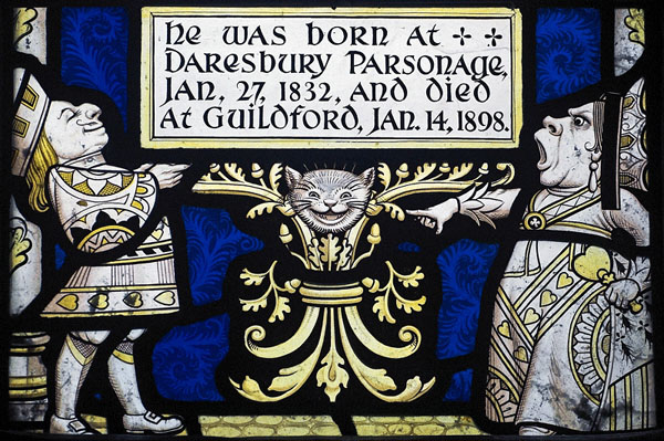
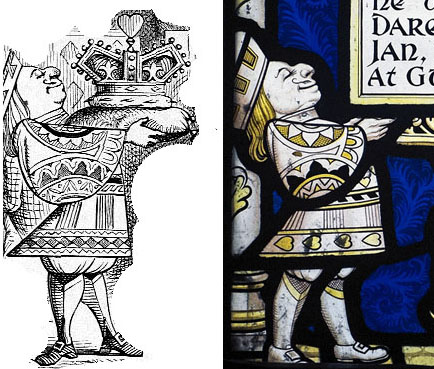
This is the only panel that features two full figures coming from the same illustration.
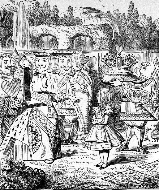
Queen of Hearts designs side by side
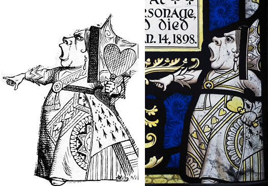
One thing that pops out to me is how the ornamentation on the clothing has changed from illustration to stained glass. The stained glass features heart designs on the clothing while the printed illustration does not.
Knave of Hearts designs side by side
