June 20, 2007
Clarke after Clarke
A surprising find on Flickr.
Irish Rebellion Panel from merrionsq's Dublin Set
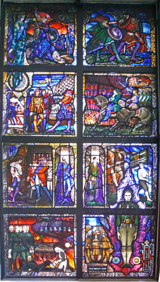
Created circa 1934 by the Harry Clarke Studio.
Currently located at Earlsfort Terrace Library UCD in Dublin, though it will be moving soon as the library is closing.
Note that it's the Harry Clarke Studio, but not Harry Clarke.
Harry Clarke died in 1930. This window was designed by Richard King.
So, what do I find so surprising?
The surprise comes from my own assumption that the Harry Clarke Studio had continued on ONLY in the realm of commissioned religious work and did not attempt any of the secular work that Clarke did in the last ten years of his life. Dazzling works culminating in what many see as his greatest acheivement, The Geneva Window.
So, I was surprised that I had never heard of this particular window by Richard King and The Harry Clarke Studio.
It must be noted that the prevailing opinion is that the "Harry Clarke Studio" had a precipitous decline after the death of Harry Clarke himself. The Rebellion panel was created just a few years after Clarke's death and the decline is not yet so evident, though it's obvious it had already set in.
The photo is fuzzy and may be over-saturated in terms of its color, but it's clear to my eye that the color work is not on a par with the Geneva Window. The coloring in the Rebellion Window is much more primary and the values are overall brighter and flatter. This becomes more evident with a side by side comparison with the Geneva Window.
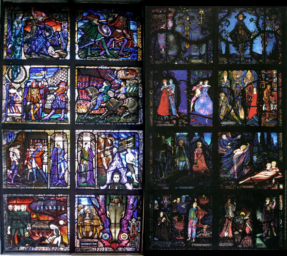
The Rebellion panel has a much more straightforward red and blue palette (at least in the upper sections) rather than the amazing range of colors Clarke got through his mastery of etching and plating flashed glass. Most importantly, Harry Clarke was a true master in terms of his use of BLACK. It's true of his black and white illustration work and true of his stained glass. I've long thought that the best stained glass is done by those who can be masterful and bold in the use of black.
Nevertheless, the Rebellion panel does have some merits, especially in the two lowest panels. The general composition and drawing quality is on a very high level. and the 'special effects' work - i.e. the acid etching, painting, staining, and layering is very beautifully done.
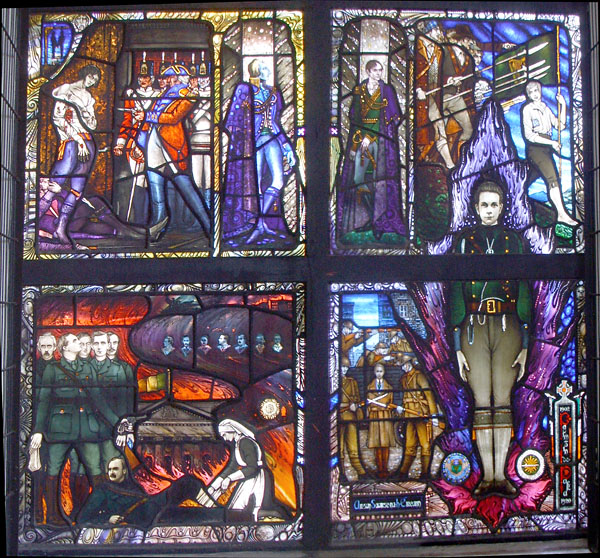
I like the figure bursting up through the frame in the lower right. The 'special effects' that was such a signature of Harry Clarke is used to nice benefit here.
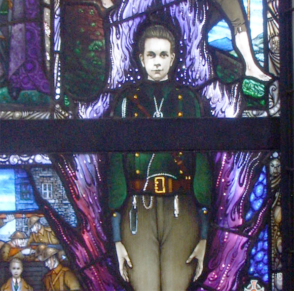
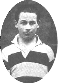
The figure is Kevin Barry, a young Volunteer who was executed by the British and became a key propaganda figure in the last years before Irish Independence.
The section I like the most is the lower left panel, which depicts the 1916 leaders at the GPO.
Everything about this panel seems to me on a higher quality than the others. The draftsmanship, the composition, and especially the color palette. Perhaps it's because these were more recent events being depicted that the designer felt a little more comfortable with this panel, and more passionate. He would have known who these men were and what they looked like - that might have made all the difference for him. This one panel seems much less like the 'faux-Harry Clarke' style that the Harry Clarke Studio turned into. I think there is even a glimmer of a style that could have evolved from the Harry Clarke style to a different but just as good Richard King style. Too bad it didn't happen that way.
[update Nov. 17, 2009 - Found a nice biographical article on the Mayo News website on Richard King. It seems like King's stint as the the 'after Harry Clarke' designer left him underrated. Definitely worthy of further study.]
The term, 1916 leaders at the GPO, refers to the taking of the General Post Office that preceded the Proclamation of the Irish Republic, all during the Easter Uprising.
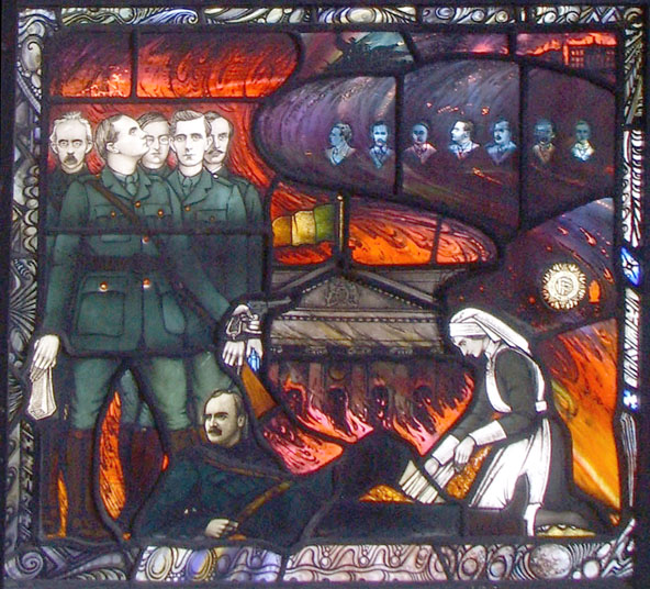
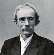
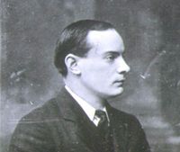
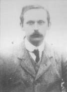
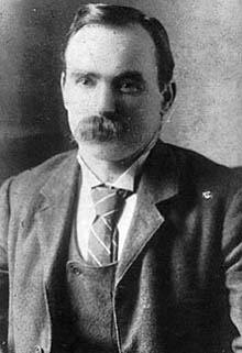
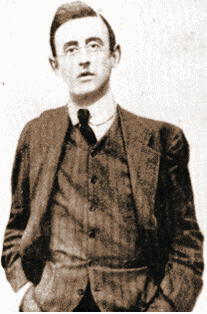
Photos and links to info on a few of the figures in the panel -
| Thomas J. Clarke
| Padraig Pearse
| Eamonn Ceannt
|
| James Connolly
|
Joseph Plunkett
|
