April 28, 2009
Emanuele Luzzati - Illustrator, Animation Designer...
and Stained Glass Artist?
Michael Sporn has recently posted several entries on the films of Luzzati & Gianini on his animation blog, focusing particularly on the designs of Emanuele Luzzati, who passed away in 2007.
A typical Luzzati illustration, from the book version of The Magic Flute.
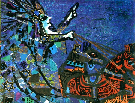
Luzzati's illustration is commonly referred to as 'stained glass like', which is to say that it features bright primary colors with strong black outlines. Because of this, I've long been curious to know if Luzzati ever designed any actual stained glass windows. It turns out he did, but only a few windows for one location. I found this article about Emanuele Luzzati called Fond Remembrances of Italian artist Emanuel Luzzati on the San Diego Jewish World website.
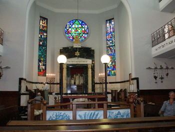
The website includes this small image showing windows designed by Luzzati for his local Synagogue in Genoa, Italy. Alas, I could find no closer images.
The other thing I've been curious about is if these 'stained glass like' designs would actually translate easily into actual stained glass. Below the fold I did a short experiment to see just how one of his illustrations might be translated into stained glass...
I'm taking one of the illustrations that Michael Sporn posted and try and translate that directly into a stained glass design.
First, just to give another sense of Luzatti's design work, here is a short segment of Luzzati & Gianini's animated film version of The Magic Flute - it's fun, too.
If you are interested there are more segments on YouTube.
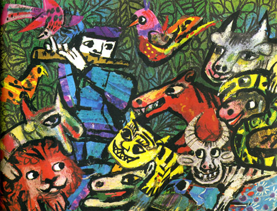
The original illustration by Emanuele Luzzati, for a book version of The Magic Flute.
Here I've turned the darker grey lines into black and added black lines to make it possible to divide the design into cuttable pieces of glass. Not a huge difference, I'd say.
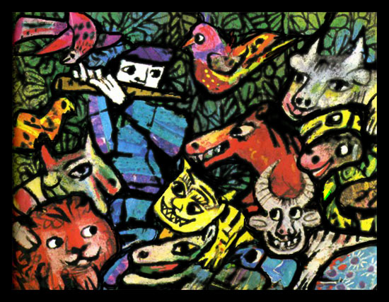
This represents the leadlines that would result. Turns out to be rather awkward in how the lines try to meet the design and not make any major changes.
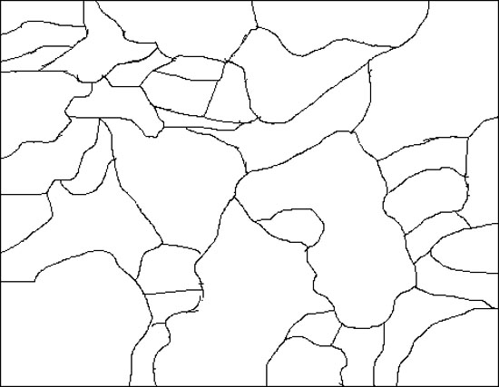
On top of that, it would require a good bit of special effects work, like acid etching or sandblasting flashed glass to get 2 colors in specific areas on one piece of glass. This piece is an especially tortured piece, with not only a dicey shape to cut, but the white areas would have to be etched out of red flashed glass, then black painted on and silverstain for the little bit of yellow on the horse head. Possible, but neither direct nor easy.
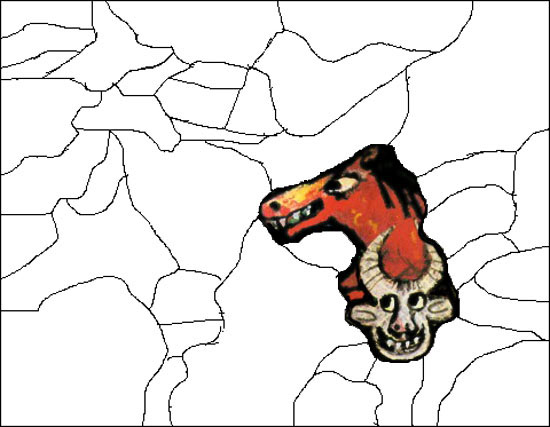
So, in this instance, it's 'stained glass like' without being easily translatable into actual stained glass.
Now, of course, it's a bit of an unfair exercise, seeing that if this were a true collaboration between designer and fabricator there would be more back and forth and the linework would become more workable without losing the original sense of the design. Ideally.
Posted by Tom at April 28, 2009 08:11 PM