February 28, 2005
Kirkwood First Presbyterian Glass
I'm going to try to document some of the glass I see over the next few months in the St. Louis area, focusing on what makes an impression. Not necessarily what is the biggest or even the best, but what is of interest to me at the moment. The small corners and little details.
First up is Kirkwood First Presbyterian Church, right across from my local public library.
The large area of glass is above the altar.
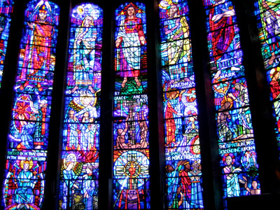
Bold black line painting, little or no tonal painting and bright primary colors.
The colors are a bit hot for my taste.
Still, I like the side aisle windows, small (about a sqaure foot each), each designating one christian symbol. There are a number of them along the wall on east wall. Of course, I always like the little panels best...
I especially like this rather languid looking ox with wings, a symbol for St. Luke - 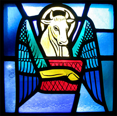
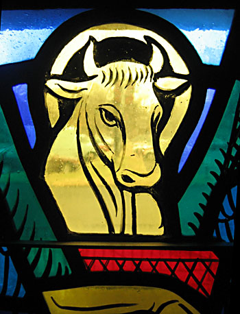
and a detail
February 22, 2005
Design process for a small panel
I am designing a small panel to be donated to an auction raising funds for a local arts organization, Art St. Louis. It's to be auctioned at a wine tasting event, therefore I'm thinking of a simple wine and grape theme. I begin with some thumbnail sketches for idea generation.
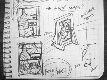
The first sketch of any kind was done in my journal.
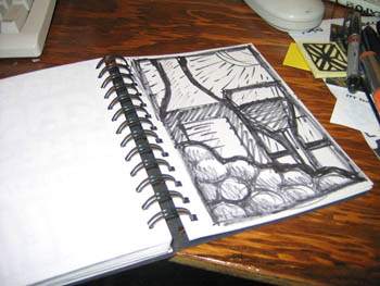
The next drawing, larger though not necessarily full size, was drawn in one of my sketchbooks. I keep anywhere from 2-5 sketchbooks going at any one time. I currently have 3 going - one larger, one smaller and one strictly for color drawings. This is in the 'smaller' sketchbook - the area for the drawings being about 4.25" x 6.75". I'm seeing the final panel as larger than that - about 7.5" x 10" or thereabouts. This being an autonomous piece, I'm not bound by any specific size. I'm thinking of it being a painted panel using nice antique glass, and one that might be put in a window or placed in a stand.
This happens to be the first sketch I drew in the sketchbook - I like it fine and think this is what I would like to go with. And yet I can't help that one drawing is not enough. So, to be sure, I did some other sketches, none of which I like as much.
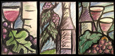
Other drawings (done in the 'color' sketchbook) - But I still like the first one the best.
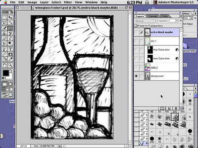
---- After scanning it, I bring it into Photoshop.
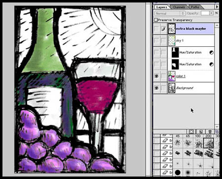
---- The first layer gets color.
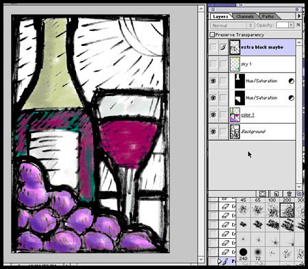
---- Then I do some minor color adjustments. I'm already starting to think of glass, the area in the bottle with the wine being perfect for some smaller scraps of gold pink English streaky that I've had for years.
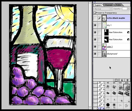
---- Then the color for the sky goes in on a seperate layer. I'm thinking of a light tint with flecks of silverstain for the sky. Perhaps enamels, but maybe not. Again, this may change when selecting glass. I might also try 2 different backgrounds, as there are not many pieces in this panel.
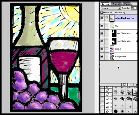
---- I then add black in a seperate layer to firm up the composition and add some break lines. Especially breaking up the 'wine' in the bottle to make sure I could use those nice but small antique english streaky scraps that I would like to use. If this were a commission I would print this as a color sketch and present it to the client.
Then I extract out the black and make into a bitmap file. This is the end of the Photoshop part of the process. Now the bitmap file gets imported in Illustrator. Basically, I use Illustrator as a CAD program. There are many designs that I do directly in Illustrator, especially larger works. I made the decision many years ago to go with Illustrator over an architectural CAD program (such as PowerCad or ArchiCad on the Mac or AutoCad on the PC) because the tools in Illustrator tend to lend themselves to more creativity. At least that's how I see it. I've never regretted the decision, other than the odd feeling I have from knowing I may be the one and only person using Illustrator in this way. I certainly have never heard of anyone else using Illustrator to design stained gass windows. I do know there are plug-ins available that will broaden the tools in Illustrator to make it into a more conventional CAD program. I haven't found I've needed them.
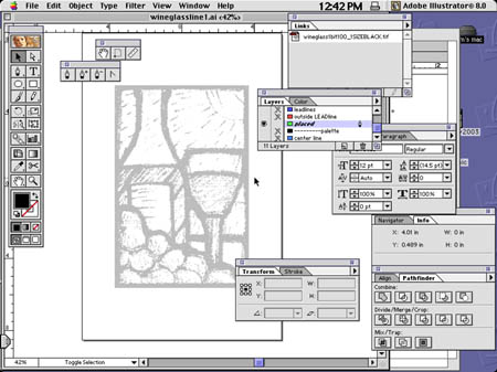
---- I place the bitmap file into a new layer in Illustrator, and dim it 50 percent.
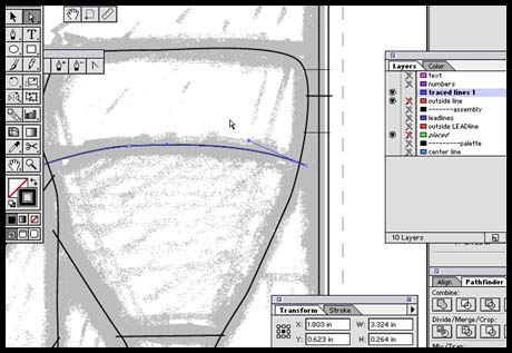
---- Then, using the pen tool, I 'trace' out where the leadlines will be.
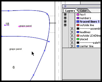
---- I then number and label the pieces. On a panel this size the whole process in Illustrator might take 20 minutes at most.
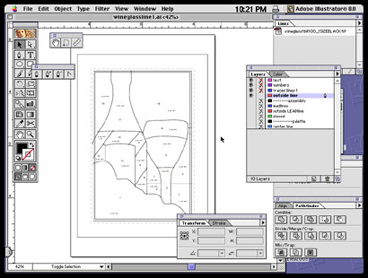
---- The pieces are ready for printing.
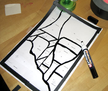
---- After printing the paper copies, I trace out the leadlines onto a sheet of acetate with an opaque paint marker. You might notice I have already made one small change. The wine glass is now going to be clearly in front of the wine bottle. It seemed to me too uncertain in the design after printing it out.
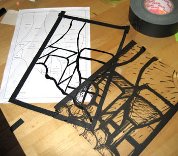
---- The other transparency is one printed from the Illustrator file with the placed bitmap included. This I use to select glass intially.
Next phase - Glass selection and painting...
February 10, 2005
Googling "New Glass"
Ive been looking at my library recently after getting my books out of storage. I find I only have 25-30 specifically on stained glass, but they are a choice selection. For instance, I keep saying I should get a Tiffany book, but I think... maybe not, I can always go to the library.
One book of note I do have One I remember getting very well -
New Glass by Otto Rigan.
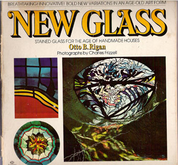
--my own well worn copy--
I first came across it when I was a teenage hobbyist in the 1970's. My primary exposure to stained glass up to this point had been in a few churches and in (I hate to admit) pattern books. I had seen very little stained glass of merit up to that point and almost nothing in a more contemporary style. So, this book was an eye opener.
It's almost 30 years since its publication and I was wondering how many of these artists are still working in stained glass. The first step - Google, of course!
Of the 25 artists mentioned in the book (including the author), fewer than half are still actively working in stained glass, perhaps as few as a third.
For instance, Otto Rigan, the author, is a working artist but he seems to be doing only sculptural public art works. Granted, some of those sculptures incorporate glass, but not in a way that suggests stained glass windows.
Paul Marioni and Dick Weiss I could only find as part of gallery websites. Paul Marioni has some of my favorite pieces in the book. Not surprisingly to me, his career veered more toward studio glass in the 80s and has never looked back. If he were being judged solely by internet exposure, he is best known now as a teacher or as the father of Dante Marioni.
Dick Weiss is an interesting case in that he is one of the few to be doing more stained glass than he did 15 20 years ago. That is, he seems to have come back to it after thirty years of doing other conceptual art. This is evidenced by the stained glass screens and the painted work he is making. He is one of the few whose work has evolved and whose recent work is more interesting to me than the work from 30 years ago.
Judy Raffael, another one whose work in the book I especially like, seems to have turned entirely to painting. That is, if I have the right person. If Judy Raffael transformed into Judy North, she is now exclusively a painter. No mention of stained glass.
The artists who are working in stained glass (or thereabouts) and have full fledged websites include Peter Mollica, Elizabeth Devereaux, Kristin Newton (in Japan!), and the inimitable Narcissus Quagliatia.
Dan Fenton does mostly fused glass and is best known for his workshops.
Ed Carpenter and James Hubbell have studios that are devoted to designing entire architectural environments, with stained glass being a small element, if used at all.
Bill Cummings moved to Western Massachusetts, runs a well known studio and has worked with many well known designers. I have visited the studio and know a number of people who have worked there.
I could find nothing on Jad King, Kerry Kelly, Fred Abrams, Sanford Barnett, Judy Jansen, Terry Markarian, Peter Wickman. There was very little on Kathie Stackpole Bunnell, Mark Adams or Hilda Sachs. I remember Bunnell having the biggest buzz in the Boston area in the early 80s when I first entered stained glass professionally.
There were many references to Robert Kehlman, but more on his role as a writer on glass art than as a glass artist. There is reference to a book of his artwork, but none of his artwork to be found on the internet. He did write a book on 20th century Stained Glass, but Ive never seen it and it seems hard to locate. Curious.
Some of this may have to do with the vagaries of internet searches, of course. Common names are never as easy to search as unique names, for instance. And, of course, thats just as far as I can tell from one afternoons googling.
February 01, 2005
More book design blogstuff
This from the book design blog foreword, pointing to a site devoted to book covers found in the NY Times Book Review - called appropriately enough - Book Covers from the NY Times Book Review. Also featuring quick and snarky comments about those covers. By turns funny, interesting, picky and prickly, but not mean spirited.
Stained Glass artists could never get away with this.
Sometimes I wonder what it would be like if they tried.