June 20, 2005
Thoughts on not going - SGAA Denver 2005
For various reasons, I'm not going to the SGAA conference this year in Denver. My feelings, as always regarding the SGAA, are mixed. I've not seen any benefit in being a member of the SGAA and so I have no interest in the business part of it. The membership does not well represent the state of the art in stained glass design. That is, I admire many more stained glass artists who are not a part of the SGAA than I do the ones who are a part of the SGAA. I don't even see the benefit in terms of joining to subscribe to their magazine, the Stained Glass Quarterly, seeing how that publication has gone so far downhill in the past decade and I haven't heard of any signs that it is trying to improve itself. I know the Quarterly has a long history and it's gone through good and bad runs for more than 70 years. Still, for a long time, the Quarterly was the best thing to come out of the SGAA. It's sad to see the quality decline so much.
My going to the conference last year had as much to do with visiting old friends and colleagues in Boston as with going to the conference. The conference, unfortunately, just reinforced my negative views of the SGAA. This despite the valiant efforts of the local organizers, who did a great job in spite of the SGAA shenanigans.
Still, they are doing something a little different with the conference this year. They have a specific subject - painting on glass. It's a good idea and I hope it works out for attendees. I know for many the best part of the conference last year in Boston was the workshop style program done on restoration at Emmanuel Church. Alas, I missed it. So, I hope the painting workshops work well. For me, the workshops of most interest would be the ones with Peter McGrain and the ones with the Derix rep talking about the float glass painting and acid etching. The St. Louis window that I posted on recently is pictured in the program schedule. I assume that commission will be discussed.
I have heard that they are going to be using only lead-free paint in the workshops. GOOD! It's about time. Have I mentioned how strongly I believe that all stained glass artists should go to using all lead free glass paint. Frankly, I don't see any reason to keep lead-based glass paint on the market. There appears to be no indication to doubt the lead-free paint on technical terms - i.e. it fires in well and is as permament as lead-based. If so, why is the lead-based paint needed? Because it 'feels' different to use it? Please.
I will be sorry to miss another conference with Peter McGrain. I've known of his work for a long time and admire his wild sense of graphic experimentation. Okay, one small criticism - he needs to update his website.
...more if I hear any buzz...
June 19, 2005
Important Pictures 1
Important to me, that is. This Self portrait by Van Gogh, dedicated to Paul Gauguin

(larger image here)
This painting hangs in the Fogg Art Museum in Cambridge, Mass. I lived for 18 years in the Cambridge/Somerville area and less than a 30 minute walk to the Fogg for more than half of those years. This painting became very familiar to me. The intensity of it fills the room.
June 18, 2005
Drawn!
Came upon this very good Illustration blog. With multiple contributors, this blog often has 2-3 entries a day. Good range of styles.
June 12, 2005
Sendak on NPR
An interview with Maurice Sendak on NPR - from early June 2005. Coinciding with the publication of a new book re-illustrating the book Bears, by Ruth Kraus, who was a mentor for Sendak in the early 50's, along with her husband, Crockett Johnson, of 'Harold and the Purple Crayon' fame. Listen carefully for the very Sendak moment when Sendak tells the interviewer how Disney turned Mickey Mouse into a 'fat whore'. Note also that the week before Sendak was part of a piece about Crockett Johnson and the creation of 'Harold'.
June 10, 2005
Derix in St. Louis
Recently saw this window at the St. Louis Regional Arts Commission's Cultural Resource Center. Here is the full exterior night shot.
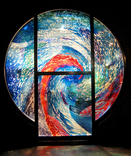
It's on the east side of the Regional Arts Commission building on Delmar in the U-City Loop in St. Louis. I must admit my first impression of this window was not positive. Granted that I had only seen it passing by in a vehicle, but I thought that it must be plastic or a cheesy non-permanent painting on glass. Basically, from a distance, this comes off as a very ordinary corporate style, status quo abstract design. (I'll try to get a daylight long shot to illustrate this...) Well, I happened to be walking past one night and got a close look at it from the outside. It's all glass and a pretty interesting piece for several reasons.
This is a closer view showing the text. The lines show the seperate pieces of glass.
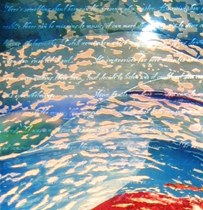
The piece is in at least three layers. The exterior layer is plate glass sandblasted with text that is not at all visible from a distance, and is barely legible up close. It's written in english, but with a hard to read cursive script. It may be more readable in daylight.
Very close at an angle to show the text most clearly.
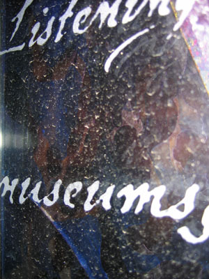
The color layers are flashed glass etched and cut and matched together in a kind of a tight puzzle. I assume it's put together with glue, though it could be fused together. The workmanship is very precise.
The details show some of the layering.
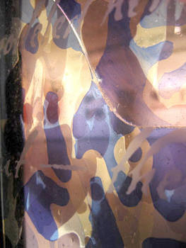
acid etched light blue and purple flashed glass - with what looks like some enamel painting, I believe.
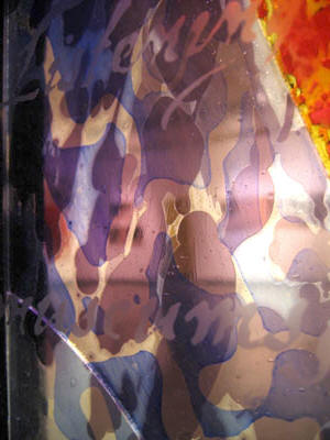
and a detail showing a more striking division of colors/glasses -
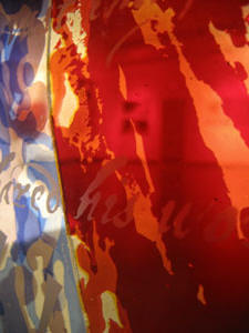
The artist is given as William M. Cochran, of Maryland. He apparently does mostly trompe l'oeil murals. The signature says it's made 'in cooperation with Derix Glasstudios'. Well, I certainly have heard of them and know they are in the forefront of developing experimental techniques on all kinds of architectural glass. Interesting that it's in St. Louis. I hear that a representative from Derix is speaking at the SGAA conference this coming month. It'll be curious to hear if this piece is mentioned.
June 05, 2005
Poetry and Art site
at poets.org - a page that focuses on the mixture of poetry and art
Be warned, it is slightly maddening. The main 'poetry and art' page has few pictures and the pages they link to have few art samples on them - but many of those pages DO links then to some interesting sites.
I like this poetry with comics by Nick Flynn and Josh Neufeld.
June 01, 2005
CAMSTL
by way of the St. Louis chapter of the AIGA website -
An interesting look at the design of the Contemporary Art Museum of St Louis by Allied Works Architecture. Now, I must confess. I am not a big fan of the building. The sketches and preliminary drawings just prove that this is a building that comes off better in the presentation than in the realization. No one in real life ever sees this from a bird's eye view or a wide angle view from well above street level. So, it's noteworthy that there are no street level drawings. From street level the place looks like a big bomb shelter; add a little barbed wire trim and it would make a stylish looking prison. Do we really want art museums that are grey, dull and formidable? Flashy website and nice presentation drawings - but for most people, in most situations, this is a stark and ugly building.
p.s. - if you want to read a good example of contemporary aesthetic doublespeak, read the section called 'premise'. It's a hoot.