September 28, 2005
Linda Lichtman
With my roots going back to the early 80's in the Boston stained glass scene, I've known Linda Lichtman for a long time now. I haven't looked at her website in a while - I'm not sure how new it is but it's a nice website for a contemporary stained glass artist. Alas, there are remarkably few good websites for contemporary stained glass artists.
She mostly does abstract work. Great stuff.
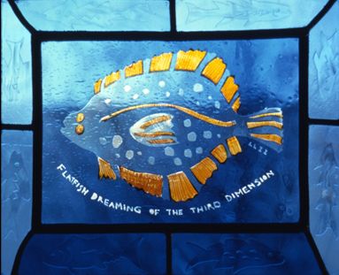
Still, I must admit, I've always liked the fish the best.

September 22, 2005
Shakespeare Stained Glass Links
What with the previous Shakepeare piece, I thought I would post some of the links I've found for Shakepeare themed stained glass. Surprisingly, there is not much to be found on the web.
A studio with a Shakespeare commission out of England. Looks like an interesting window, though it's hard to tell as it's a small picture on a really clunky website.
This Seven Ages of Man window for the Folger Shakespeare Library in DC, designed by Nicola d'Ascenzo. Though it seems technically adept, it also seems to lack a certain vivacity. I'd have to see the actual window. I've longed to visit the Folger.
The Shakepeare window at Memorial Hall at Harvard University. The Shakespeare window is about halfway down the page.
Other than a few simple undistinguished medallion panels, that's it. Curious.
September 19, 2005
The Shakespeare Thing
I was just watching a tape of one of my many Shakespeare documentaries and I was wondering - why haven't I done a Shakespeare panel in stained glass? After all, I have held a near obsession with the plays of Shakespeare for more than 25 years. I've seen every play. I've done other stained glass panels dedicated to literary figures - why not Shakespeare?
I had thought of doing a Shakespeare panel in the Quotation series, using this quote, from "All's Well that Ends Well" -
"The web of our lives is of a mingled yarn, good and ill together: our virtues would be proud, if our faults whip't them not; and our vices would despair, if they were not cherished by our virtues. "
The general ideas come but the images don't. The composition and structure alludes me. For instance, I have a commission for a Shakespeare window but I have yet to crack the design problem. It is to be a Shakepeare insult panel - inspired at least somewhat by the famous internet Shakespeare insult generator, featuring a mix of fake but real sounding generated insults and some insults taken directly from the plays. My favorite Shakepearean insult is most likely to be front and center in the panel -
from King Lear
OSWALD
What dost thou know me for?
KENT
A knave; a rascal; an eater of broken meats; a
base, proud, shallow, beggarly, three-suited,
hundred-pound, filthy, worsted-stocking knave; a
lily-livered, action-taking knave, a whoreson,
glass-gazing, super-serviceable finical rogue;
one-trunk-inheriting slave; one that wouldst be a
bawd, in way of good service, and art nothing but
the composition of a knave, beggar, coward, pandar,
and the son and heir of a mongrel bitch: one whom I
will beat into clamorous whining, if thou deniest
the least syllable of thy addition.
Now, that's an insult. But what pictures to put with it? There is always the approach of simply putting a portrait of Shakepeare with the quote, but that seems a bit strange with the insult quote. Perhaps make it all text, with different dynamic fonts. That might be the best approach. Perhaps one that somehow subtly incorporates the famous Dreoshout portrait (the one on the first folio) of Shakepeare.
September 18, 2005
Lettering know-how
Today's entry in the category of "Things stained glass artists need to know about" - Typography.
A good website to start with is Thinking with Type. It's important to note that these ideas like tracking and kerning come into play whether the letters are being drawn by hand or generated on a computer and then transferred in some manner to glass. They also come into play whether the lettering is for decorative purposes or pure utility.
September 17, 2005
Landscapes at the SLAM
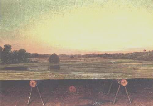
Early this month, I checked out "Nature and the Nation: Hudson River School" at the St. Louis Museum of Art. An exhibit of American Landscapes from the Wadsworth Athenaeum in Connecticut. I went not for the landscapes, which don't do much for me, but because it was from the Wadsworth, the first art museum I ever visited on my own in the late 70's near where I grew up in Connecticut. The Wadsworth at that time made a big impression on me. It's not a big museum but it has an interesting collection, with the surrealist items making the biggest impression at the time. The thought of surrealists was ironic since practically the first picture I saw in the SLAM landscape show was this curious piece of proto-surrelaism in the midst of the dour landscapes - "Gremlin in the Studio II" by Martin Johnson Heade

This is a trompe o'eil with a typical Heade marsh landscape above and below a view of the sawhorse type things holding up the landscape and a crudely draw stick figure of a 'gremlin' doing a little jig underneath the landscape. Very odd.
All that and I still like Heade's still life paintings and bird/flower paintings much better.
September 04, 2005
The Comics Thing
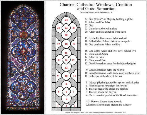
I came across this page with a reading of the Good Samaritan window at Chartres Cathedral. Here is the diagram - it's bigger when you follow the link

I have long thought of the possibilities of stained glass as 'sequential art'. This page reminds me once again that there is a precedent for it. I witnessed this window being 'read' as a story by the long time English guide at Chartres, Malcom Miller, and I remember thinking at the time - this thing is a comic strip!
The Good Samaritan/Creation window is especially interesting to me in that it translates so directly into the form of a modern comic strip, except that it goes bottom to top rather than top to bottom. It certainly has panels with gutters - gutters being the bands of space outside story panels that are usually blank, but here are highly colorful and ornamental.
I also love the sophisticated narrative. Two stories on top of each other that then relate to each other. The telling of the Good Samaritan first, then the story of Adam and Eve. The idea being that the act of compassion by the Good Samaritan is a metaphor for Christ's act of compassion in sacrificing his life for fallen man - Christ is the Good Samaritan. Unfortunately, this sequential element was never developed further in stained glass past the 14th century or so, and certainly does not exist at all today.