May 26, 2008
St. Bartholomew War Memorial Window
This is the War Memorial Window in St. Bartholomew's Anglican Church, Ottawa, Canada, by the Irish stained glass artist Wilhelmina Geddes.
On the page for the Registry of Stained Glass Windows in Canada 'Featured Windows', you can download a very good article (pdf) from Irish Arts Review 1994 by Shirley Ann Brown. This article gives the best and most complete story of the commission.
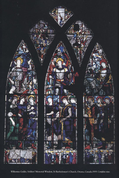
no photographer credited
photos are from the Irish Arts Review pdf, unless otherwise noted.
I could find no general biography of Geddes on the web, except for a few behind academic curtain walls. This was her only North American Commission.
I saw this window nearly 20 years ago while attending an animation festival in Ottawa and I've been trying to describe it to friends and colleagues ever since.
Unfortunately, I took only a few slides of the window, all details. I was stunned by it then and the images still resonate with me now. The initial emotional impact is strong and the sense of richness and depth in the details makes it a window that you can mull over for a very long time.
St. Bartholomew's is a small parish church and while this window dominates the east wall, the bottom of the window is at eye level and almost all of the detail is clearly visible. As I recall, the figures are not life size. Neither the St. Bart's website nor the Irish Arts Review article lists the window's size.
The St. Bart's site has a nice writeup discussing the iconography of the window. This page also has an image that gives a better sense of scale.
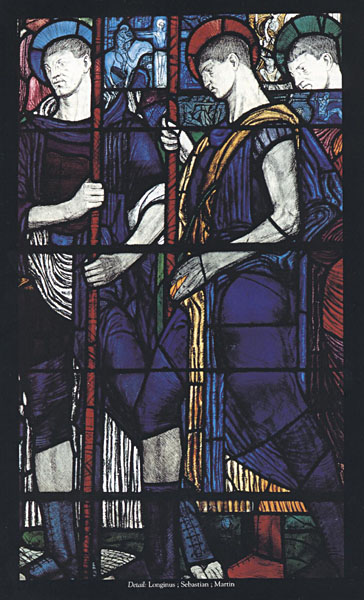
center lancet with the figures of Longinus, Sebastion and Martin
Three Figures in Each panel -
left lancet -
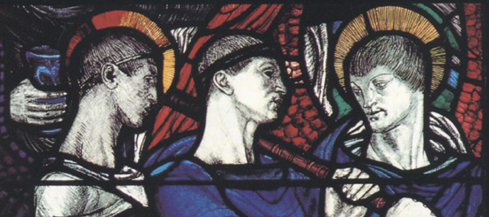
Raphael, Slain Warrior and Gabriel
Center lancet again closer
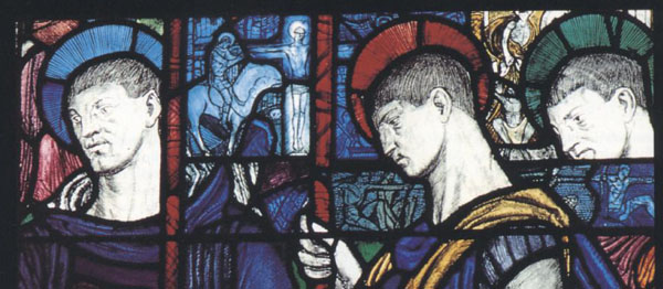
Longinus, Sebastion and Martin
Note all the small scenes happening behind and around the larger figures.
Right Lancet

Edmund, Joan of Arc and Louis
Small details from the bottom most area of the panel -
these are my photographs from my visit in the late 80's.
from this section at the lower left
I like the rough expressive quality of the painting and etching.
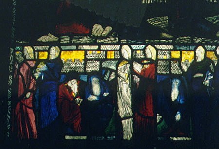
Just like me to focus on the mourners rather than the soldiers.
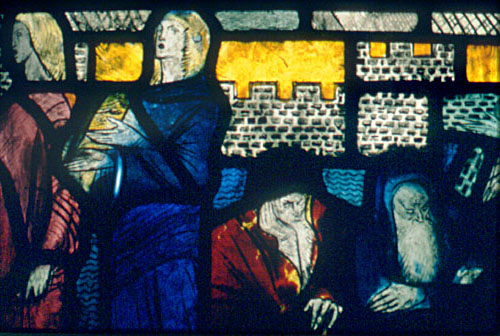
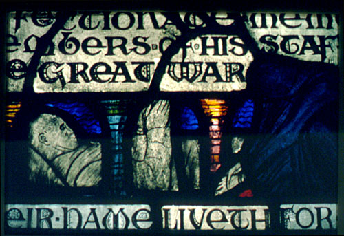
As much as I like this window, I've always had mixed feelings about war memorials. Just how do you honor the dead and those who served without honoring, and therefore perpetuating, the institution of war? Is such a thing possible?
So why then do I like this window so much? I may be reading into it or projecting my own views but I see this as expressing a more somber, as opposed to a reverential, view of war. Rough, sketchy, a bit chaotic, and certainly not sentimental. On reading the Irish Arts Review article, it would seem the window was criticized in its time, but there are no specific details given and I'm not sure if such criticism had to do with content or style - or both.
Any time I think of war memorials, this particular movie scene comes to mind - written by Paddy Chayevsky for the movie version of William Bradford Huie's "The Americanization of Emily". This is a quote from the movie, pure Paddy Chayevsy...
We shall never end wars, Mrs. Barham, by blaming it on ministers and generals, or warmongering imperialists, or all the other banal bogies. It's the rest of us who build statues to those generals and name boulevards after those ministers. The rest of us who make heroes of our dead and shrines of our battlefields. We wear our widows' weeds like nuns, Mrs. Barham, and perpetuate war by exalting its sacrifice.
It's a complex sentiment from a complex scene from a complex movie, especially when you consider it's a comedy. It's not anti-war, yet it is anti-reverence-for-war. You can see the whole scene in context on Youtube.
Finally - note that the leading expert on Wihelmina Geddes, Dr. Nicola Gordon Bowe, will be presenting a talk on Wilhelmina Geddes at the 2008 American Glass Guild Conference on August 2, 2008. I'm planning on being there and very much look forward to Dr. Bowe's presentation.
May 18, 2008
Rose Trellis Installation video
This video is of an installation in a house in Massachusetts.
Rose Trellis, by Lisa Tiemann.
Lisa was one of the first people I worked for in stained glass, nearly 30 years ago. I worked on this panel, but only for a few weeks of cutting, while on vacation in Boston in the summer of 2006. I can attest that many many hours went into making this window. It's nice to see the video because I never saw the finished piece.
The next video shows some of the foiling being done by Lisa's then assistant Serra. Serra's the one who did the 2 videos as well.
May 13, 2008
Artist and Patron
More video comic relief - this time from The Secret Policeman's Biggest Ball.
Again, not related directly to stained glass, though it does explore the unique and mysterious relationship that exists between an artist and a patron. As art commission situations go, this is actually not too far off the mark - at least it can feel like this sometimes.
May 09, 2008
Rufus Butler Seder
Did you know? The number one best selling children's picture book this week, according to Publisher's Weekly, is by a glass artist. The book is called Gallop!: A Scanimation Picture Book. The artist is Rufus Butler Seder, and I should note that he doesn't call himself a glass artist. He's more like an inventor/artist/filmmaker who happens to work with glass. The picture book is an extension of his Kineticards.
The glass art comes in with the glass tile murals that he calls Lifetiles. These are lenticular glass tiles that show a remarkable range of motion. The story of how he developed the process is fascinating.
There is no way that you can get the proper effect of any of this with a still image, so you have to see the videos. There are none to embed, but he's got a page of videos of the murals and videos of the gallery works for sale on his website.
Keep in mind as you look at the videos that all you are seeing is glass and fired-in paint. Nothing else. So, the materials are just the same as a piece of painted glass in a stained glass window.
Rufus is well known in the Boston area and I had the pleasure to be in an exhibit with him in 1996, at the time that the Glass Art Society held a conference there.
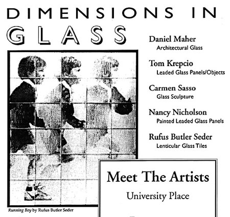
Portion of a flyer for the 1996 exhibit -
Congratulations Rufus for being a best seller!
May 08, 2008
Stained Glass Pie Chart
Very curious. At least it's not a pie chart for religious consumer spending.
May 06, 2008
Many-Colored Glass in The New Yorker
This is a first. A 3,000+ word article about stained glass, called Many-Colored Glass, in the venerable magazine The New Yorker. It's written by Peter Schjeldahl about contemporary German painters Gerhard Richter and Sigmar Polke, and their individual forays into stained glass. Richter for the recently dedicated window at Cologne Cathedral, and Polke for the unfinished set of windows going into the Grossmünster, in Zurich, Switzerland.
It crosscuts between profiles of Richter and Polke, all the while interspersed with Schjeldahl's exasperated and slightly maddening history and assessment of stained glass. I've got to mull this one over before I comment further.
A technical note - the article does clear up one technical question about the Cologne window. As suspected, the panels were laminated and not fused. There would not have been the boasting about using handblown glass if they had been fused, as the fusing would destroy the texture of the handblown glass. My guess is that the individual panes of glass are sandwiched between two layers of plate glass.
Quick links for Gerhard Richter and the Cologne Cathedral window -
My previous posts on Richter's Cologne Cathedral Commission here and here.
Wikipedia entry for Gerhard Richter
Fun context - Cologne window as pixel art (SG about 3/4 down page)
Quick links for Sigmar Polke and the Grossmünster -
New York Times article from 2007 called The Alchemist's Moment
Wikipedia entry for Sigmar Polke
Wikipedia entry for the Grossmünster
Pictures of the Grossmünster
May 05, 2008
New Window - St. Martin in the Field
A favorable review by Rebecca Geldard in the Guardian, called New Window in St. Martin's Past, about a stained glass window by Iranian born artist Shirazeh Houshiary created as part of a mojor renovation and expansion of St. Martin in the Fields, in London, England.
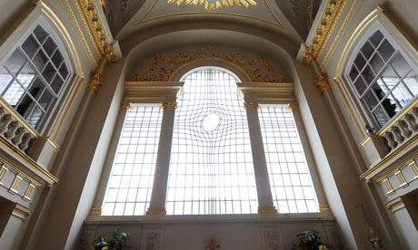
photo by Linda Nylind for the Guardian
Meanwhile, in another article in the Guardian, called New Look of St. Martin's, Jonathan Glancey praises the restoration in general but does not seem to like the stained glass so much, referring to it as the "one controversial note struck in the otherwise impeccable interior".
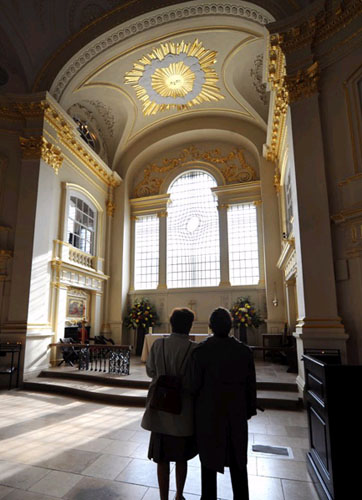
photo by Linda Nylind for the Guardian
Personally, I think the stained glass works remarkably well. Admittedly, my first reaction was that it's a bit minimalist for my taste. But looking over the images in context in the "New Look - St. Martin's" photo tour, it became clear that the design works beautifully for the space. Color, certainly bold color, would have been totally wrong for an 18th century classical space. The same with figural imagery. In terms of style, the question would be how to integrate with the classical 18th century surroundings while acknowledging that this is a new window. Most contemporary artists, when asked to do a commission like this, simply impose their own style, with the result looking jarring and disjointed. I do wish the Guardian had published all five commissioned designs when they were on display in 2006.
I imagine they did indeed make the best choice. It is impressive that Housiary working with Pip Horne, her architect husband, tried to balance the different aspects. A design that attempts to acknowledge the sacred space and also work within the design elements of the classical past while trying to make it clear that this is a new part of the church, and obviously from a design aesthetic of the present. That's not an easy balance, but it was handled well here.
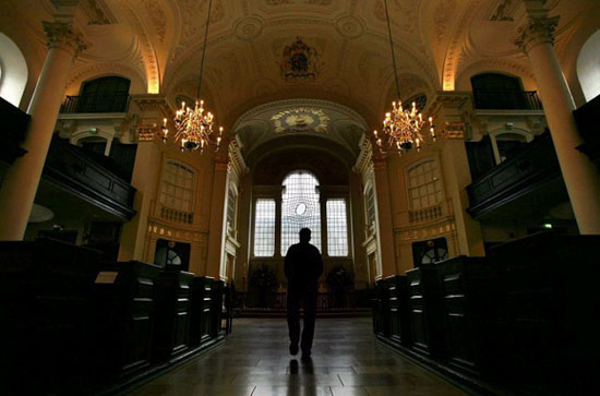
photo by Christopher Furlong/Getty Images
May 03, 2008
Norwich Stained Glass Website
via the April, 2008 edition of Vidimus -
Stained Glass in Norfolk and Norwich
Lots of nice details. A little cluttered and confusing to navigate at first, but worth the effort as there is a wealth of images and information. If you like the Norwich school, this site is essential. The Norwich School is known for it's unique style of glass painting. These examples, from Flickr, are pretty typical.
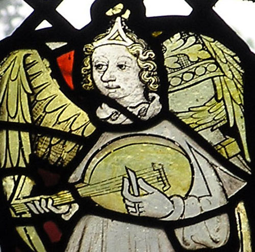
St John the Baptist Church, Timberhill, Norwich, Norfolk, UK - May 2006
from Flickrite E11y
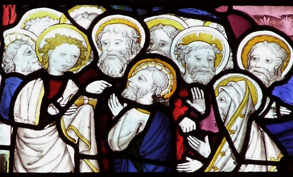
from a St. Peter Mancroft Flickrset
I've always loved the 14th-15th century Norwich-style faces in particular. By today's standards they would be considered too 'cartoony', but I think of it as emphasizing character over a superficial idea of beauty or proper proportion. This is seen clearly when compared to one of the modern replacement windows at St. Peter Mancroft. Give me the older 'cartoony' style any day.
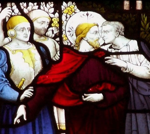
A nice and unique feature of the new Norwich SG website is an area called Trails, which are maps that have mini-tours of 3-4 churches at a time that you can travel to on your own. It's a great idea. I wish other SG websites would try it out.