November 27, 2011
The Animalarium
Every once in awhile you come across a nice non-glass site that is just good for looking at the pictures. This one is a blog called The Animalarium, which focuses on the stylized illustrated depictions of animals. Wonderful variety. Variety of styles, variety of animals (and birds and insects and other creatures). Much inspiration.
Just one sample - April 2011 post, Songs from the Garden, birds with flora. These are just a few from that post -
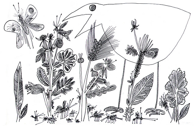
Suau Steinberg, 1945
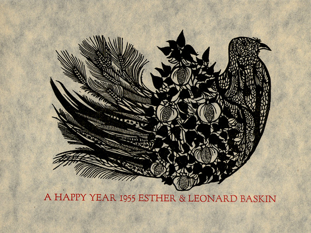
Leanard Baskin, 1945
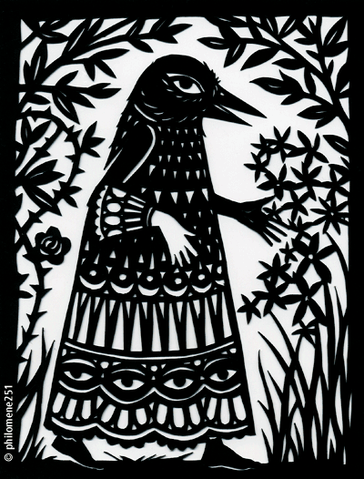
Paper Cut, "on peut disparaître ici... "
November 08, 2010
Ceramic Theme & Variations by Piero Fornasetti
Every once in a while I come upon an artist I feel I should have known about for years, but have only heard about recently. Like today.
I just finished reading the article The Man Who Launched 1,000 Plates, about ceramic artist Piero Fornasetti (1913-1988), by Alice Rawsthorn, for the New York Times, November 7, 2010.
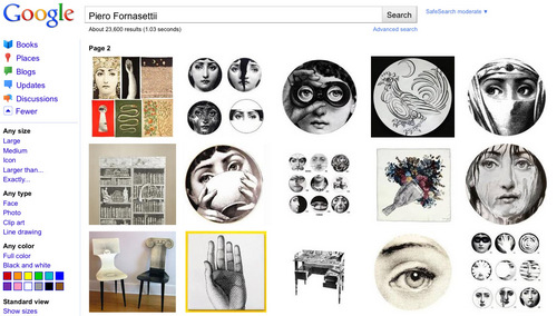
I was especially intrigued by the faces. So I did a Google search.
A screen shot of a Google search for Fornasetti, November 8, 2010
Click on image to see full size
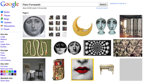
I really like the faces, officially called the "Theme and Variations", modeled loosely on Lina Cavalieri, an early 19th century Italian soprano. There are several hundred of these variations, all on ceramic plates. You can see more in detail at http://www.fornasetti.com, the official website for the Fornasetti Design shop, continued by his son Barnaba Fornasetti. There is more in there than just ceramic plates, but I think the plates are the best.
September 10, 2009
Ponyo, Miyazaki and the Stained Glass of the Studio Ghibli Museum
I saw the new movie 'Ponyo' last weekend with my daughter. We both loved it.
It's a strange and complicated story, based very loosely on The Little Mermaid, about a goldfish who wants to be a human girl. I've dubbed it the "Citizen Kane of Transforming Goldfish movies". The way I see it, the movie is a weird and delightful story about being a very young child. Rarely have I seen any movie capture the mad, exasperating, wonderful and frightening energy of small children before.
Aside from the fact that the director, Hayao Miyazaki, presents an aesthetic that any artist of any medium would appreciate, there is a specific stained glass connection within the world of his studio, Studio Ghibli. It comes through the Studio Ghibli Museum, which is located just west of Tokyo in Japan. Designed by Miyazaki himself, the building features stained glass throughout, depicting characters from Miyazaki films. The translations are only okay, in my opinion, as they are just the characters without the settings, and the linework is neither as precise nor as rich as in the movies. Still, it is nice to see stained glass in the museum at all.
This is a video tour of the Studio Ghibli Museum, giving a good overview of the building itself, but with only glimpses of the stained glass. Japanese, with English subtitles.
One of the stained glass windows in the Studio Ghibli Museum-
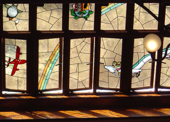
via flickrite Jonathan O'Donnell
and a detail showing 2 characters, Chihiro/Sen and Haku (in dragon form), from Spirited Away, one of my 2 favorite Miyazaki films.
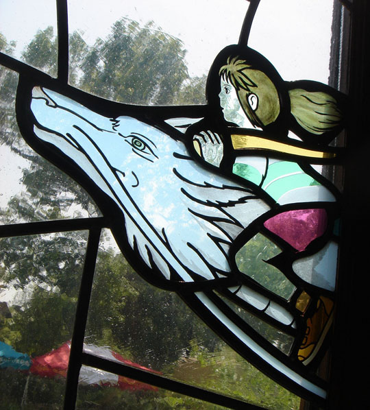
Image from Spirited Away from flickrite Archangeli
To demonstrate why the stained glass doesn't quite match the detail or exuberance of the movie, just look at this trailer for Spirited Away. Do a freeze frame right before the end, at 2:26, and compare it to the stained glass.
There are more and better stained glass windows in the museum, but not many high quality photos of them show up on the internet as the museum has a no photography inside policy. Still, there are a good number of decent shots searching for Studio Ghibli stained glass on Flickr. It's where I saw this photo of stained glass, based on my other favorite Miyazaki movie - My Neighbor Totoro.
August 23, 2009
Influences - Len Lye
Len Lye never worked in stained glass. Still, I consider his works an important influence on my stained glass work.
As a film animator, Len Lye drew, painted, scratched, and printed directly onto the motion picture film itself. This film is called Trade Tattoo, made in 1937, and it represents his most complex mix of style, image, music and message. It's my favorite of Lye's films.
So how does this influence a stained glass artist? For me, it made me think about working directly with the glass itself and not pre-designing on a piece of paper or in a computer - bashing away at the glass in an improvisational manner without a set idea where it would go. Sometimes it comes together, sometimes not, but I would never have come up with a design like this, or even this, without seeing these Len Lye films first.
Len Lye purists don't tend to mention Trade Tattoo, as the commercial 'message' is more fully integrated into the film. They prefer to show the ones that either just show the message as a throwaway at the end or the later films that are purely abstract.
If you're interested, there are more Len Lye films, plus a peek at his kinetic sculpture, embedded below the fold...
[update August 25, 2009 - just found out there is a big Len Lye Exhibition going on at the Australian Centre for the Moving Image, in Melbourne, though October. Interesting coincidence...]
Colour Box is probably his most famous film, and is always included in screenings of Lye's works. Made in 1935, it was the first film of his using the direct film process that was screened to the public.
Swinging the Lambeth Walk, 1940 -
Usually these early works are shown only because they can be shown as precursors to the real artistic works of Len Lye.
This is Free Radicals, made in 1958, some 25 years after the earlier films. It's a pure, non-message abstract film. Personally I find it a bit too dour for my taste, but it is still a decidedly great abstract work. I especially like the almost 3D quality of the shapes spinning in space.
For all his fame as a pioneer animator, Len Lye is probably best known in his native New Zealand for his kinetic sculptures. There are a few YouTube videos that demonstrate the kinetic sculptures, including some like this, Kinetic Sculptures, with Lye himself talking about the work.
I like this one best though -
The cheekygirl10 Guide to Len Lye -
June 20, 2009
Medieval Summer in New York City.
New York is the place for Medievalists this summer as there are two top notch exhibitions going on right now.
Pen and Parchment: Drawing in the Middle Ages is a show of drawings at the Metropolitan Museum of Art. While at the Met you can also see the recently authenicated First Painting of Michaelangelo. The painting was presumable done when he was just 13, and it is Michelangelo's version of a Schongauer engraving, Saint Anthony Tormented by Demons.
Pages of Gold: Medieval Illuminations from the Morgan - The Morgan Library and Museum is another one of my favorite places in New York city. I'm sure this is a great show.
If you can't make it (like me) then the Morgan has been generous enough to post the images on their website, in high resolution, all zoomable, so you can pore over the details. There are some surprises when looking deep into the details.
Just one quick example - this is a portion of a page showing the Adoration of the Magi, 1500. But if I was asked where this came from I might just as easily imagine it a modern illustration for a children's book.
I'm always fascinated by the details. Go to the website and have a good browse. Better yet, if you're in NYC, go to the Morgan and see them yourself.
May 11, 2009
LIFE Photo Archive Online
If you haven't done it already, check out the LIFE Photo Archive hosted by Google.
When I was growing up in the mid-60's, LIFE magazine was for me the most important part of the weekly news cycle. This was because LIFE magazine had the best images of current events. Movies created big beautiful images, but it was never 'current' enough. TV was immediate, but at that time the image quality was lousy, mostly filled with still studio sets and talking heads. LIFE magazine was the grand canvas for current world news and culture. Its almost impossible for anyone under the age of 40 to even imagine what kind of anticipation there was waiting for the current issue of LIFE magazine to show up in your mailbox once a week. Of course, all that changed rapidly as TV mobile technology improved, and then cable TV expanded the number of images, and eventually the internet came in with even more diverse and instant imagery.
So, as this is a blog about stained glass, I was curious to see what would show up in a search for 'stained glass' in the LIFE image archives. Some images I expected, like 20th century modern art related stained glass (LIFE's heyday was from about 1940-1970). In some cases, where I might expect to find something, there was nothing. For example, there are images of the National Cathedral, but no stained glass.
And there were some very odd surprises. More on that later.
One example of a totally expected image. French painter Marc Chagall working on a stained glass window, circa 1960. Expected since I remember a good number of photo essays on modern artists in the pages of LIFE.
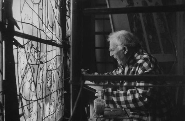
more modern artists and a few oddities after the fold...
all images © Time, Inc.
Modern stained glass artists in LIFE
Henry Matisse in 1951 at perhaps the most famous of '20th century modern' stained glass commissions - Vence Chapel.
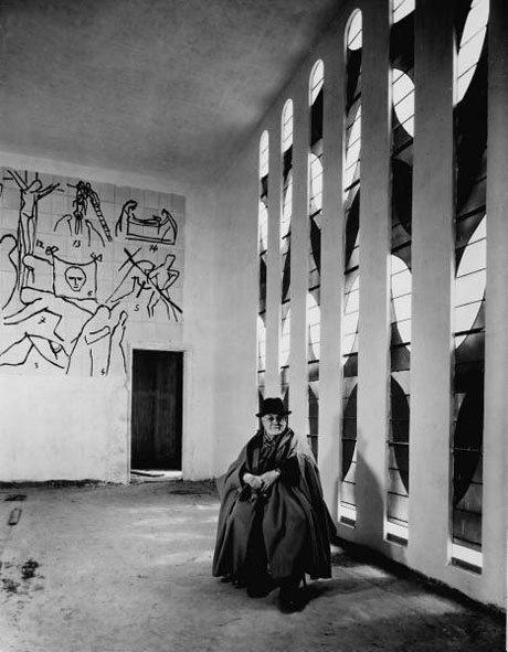
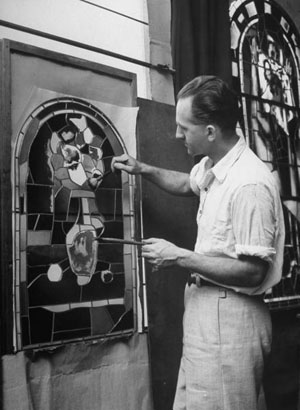
The stained glass artist who translated Matisse's designs was Paul Bony, from 1949.
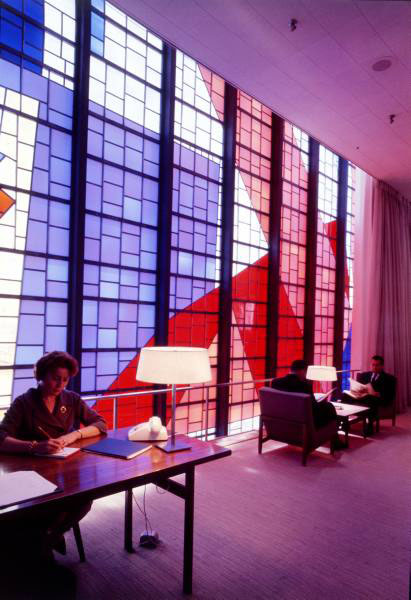
The Robert Sowers Kennedy airport windows, from 1961. I expected this in LIFE, but not with such nice hi-res color shots. This is the commission that was recently dismantled.

Interior
Young Seigfried Reinhardt, in 1952, before he became the stained glass artist Siegfried Reinhardt. There are some 72 shots in this photo archive.
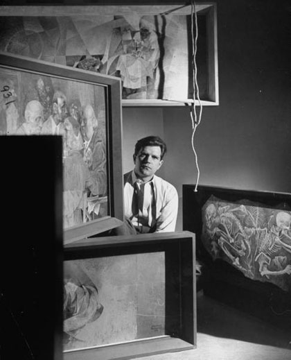
Stained Glass in LIFE - the oddities
A creepy oddity -
Dedication of a stained glass window to J. Edgar Hoover, circa 1966.

From a quick net search this seems to be taking place at Capitol Hill Methodist Church, though there is no mention of the Hoover connection on their website. No big surprise in that.
A nice oddity -
The Stained Glass House, circa 1971. This is someone's house in the woods. No further info given, other than that the Photographer was John Dominis.
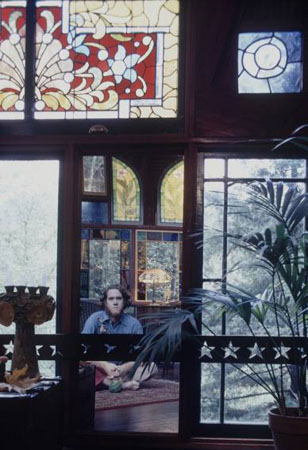
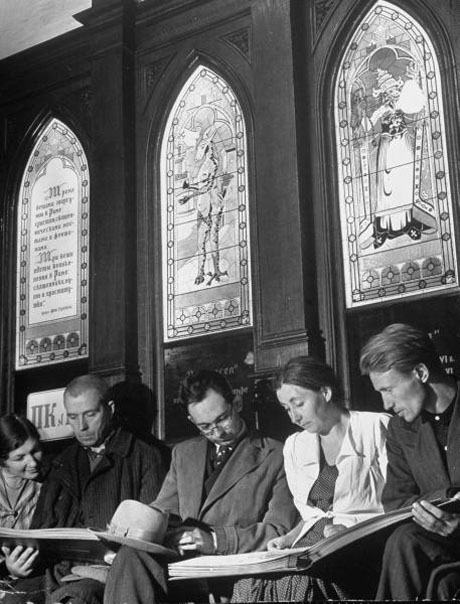
And, finally, a beyond bizarre oddity -
Anti-Religious Museum, Moscow 1941, photos by Margaret Bouke-White
the windows in more detail.
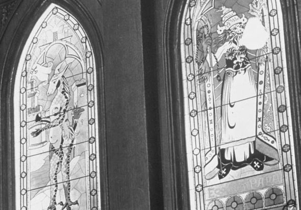
Obviously not real windows, but one still cannot help but react with utter bafflement.
There are more images throughout the LIFE archive related to stained glass. There was an issue with Chartres as the cover, but the quality of the images (at least the ones online) are surpisingly poor.
April 28, 2009
Emanuele Luzzati - Illustrator, Animation Designer...
and Stained Glass Artist?
Michael Sporn has recently posted several entries on the films of Luzzati & Gianini on his animation blog, focusing particularly on the designs of Emanuele Luzzati, who passed away in 2007.
A typical Luzzati illustration, from the book version of The Magic Flute.
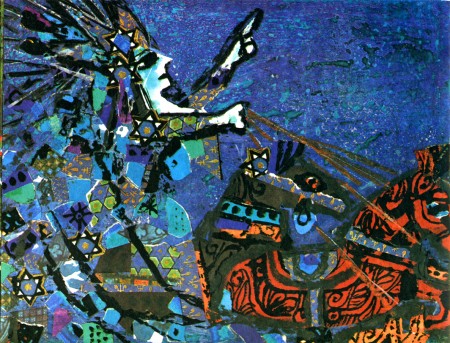
Luzzati's illustration is commonly referred to as 'stained glass like', which is to say that it features bright primary colors with strong black outlines. Because of this, I've long been curious to know if Luzzati ever designed any actual stained glass windows. It turns out he did, but only a few windows for one location. I found this article about Emanuele Luzzati called Fond Remembrances of Italian artist Emanuel Luzzati on the San Diego Jewish World website.
The website includes this small image showing windows designed by Luzzati for his local Synagogue in Genoa, Italy. Alas, I could find no closer images.
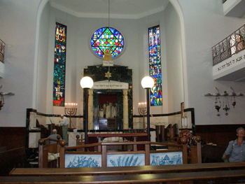
The other thing I've been curious about is if these 'stained glass like' designs would actually translate easily into actual stained glass. Below the fold I did a short experiment to see just how one of his illustrations might be translated into stained glass...
I'm taking one of the illustrations that Michael Sporn posted and try and translate that directly into a stained glass design.
First, just to give another sense of Luzatti's design work, here is a short segment of Luzzati & Gianini's animated film version of The Magic Flute - it's fun, too.
If you are interested there are more segments on YouTube.
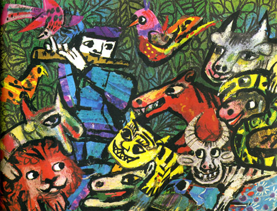
The original illustration by Emanuele Luzzati, for a book version of The Magic Flute.
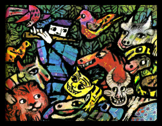
Here I've turned the darker grey lines into black and added black lines to make it possible to divide the design into cuttable pieces of glass. Not a huge difference, I'd say.
This represents the leadlines that would result. Turns out to be rather awkward in how the lines try to meet the design and not make any major changes.
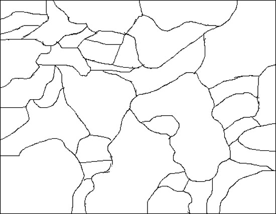
On top of that, it would require a good bit of special effects work, like acid etching or sandblasting flashed glass to get 2 colors in specific areas on one piece of glass. This piece is an especially tortured piece, with not only a dicey shape to cut, but the white areas would have to be etched out of red flashed glass, then black painted on and silverstain for the little bit of yellow on the horse head. Possible, but neither direct nor easy.
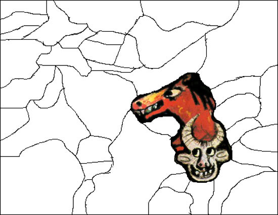
So, in this instance, it's 'stained glass like' without being easily translatable into actual stained glass.
Now, of course, it's a bit of an unfair exercise, seeing that if this were a true collaboration between designer and fabricator there would be more back and forth and the linework would become more workable without losing the original sense of the design. Ideally.
July 11, 2008
The Medieval Bestiary
Surprised I haven't stumbled on this before - The Medieval Bestiary - Animals in the Middle Ages. Looks like a great site for reference material. Just a quick look so far, but the galleries look very good, if a bit confusing to navigate.
On top of that, the site also hosts Chimera, the Bestiary Blog, which led me to Per Omnia Saecula - Adventures in Medievalism, a medievalist blog which has a slew of links to other medievalist websites and blogs. This could take days to fully explore. I love it when I hit a new vein of interesting and useful information on the internet...
July 25, 2007
A Color Lesson
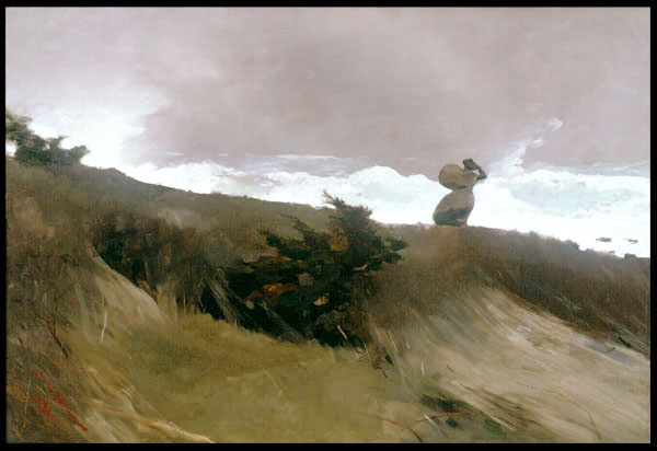
West Wind is a painting by Winslow Homer, located at the Addison Gallery of American Art, in Andover, Massachusetts.
What does it have to do with stained glass?
The LaFarge connection -
"Charles L. Homer told me that sometime before painting The West Wind, Winslow had been dining with John LaFarge in New York; the two were devoted friends but had many conflicting ideas about art, especially in the field of color. LaFarge criticized Winslow for using too much brown and said his paintings were too dull-toned. Unlike Homer, he was an avowed admirer of European techniques, especially the rich color of the Venetians. Winslow wagered him a hundred dollars that he could paint a picture in browns which would be accepted and admired by critics and the public as well. After Reichard, the dealer who exhibited The West Wind, had reported to Homer the obvious popularity of the work, Winslow wrote to LaFarge: "The West Wind" is brown. It's damned good. Send me your check for $100."the quote is from this page of footnotes.
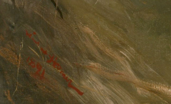
I've been to the museum and seen the painting - it is damned good. I particularly like the fact that there is one shot of bright color in the painting - the signature.
July 20, 2007
Star of David Blog
A blog entirely devoted to images and stories related to the Star of David.
The variety of images and wealth of information on what would seem a narrow subject is astonishing. On top of this there are more than a dozen references to stained glass incorporating the Star of David. Very interesting all around.
I've always been intrigued by the idea of how different designers in different situations incorporate and interpret the same idea or image or symbol. I'm also interested as I've done my own variation on a Star of David in stained glass.
one of the stained glass images featured on the blog -
Stained glass panel from Cimetière du Montparnasse, Paris, France
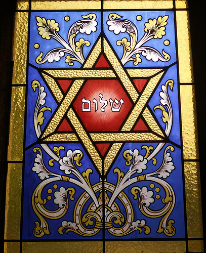
image via flickrite fugue
The hebrew lettering in the center represents the word for 'peace'.
July 14, 2007
Radical Ornamentalist SG in the UK
from Leo Reynold's Photos.
Said to be from St George Tombland, Norwich, Norfolk, England, UK
but I could find no further info.
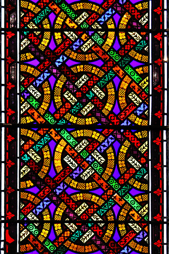
full pattern field
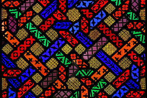
I like.
December 21, 2006
15th century Moonman
Been terribly busy this month, so little posting. I do have several longer posts germinating and I hope to post some of these over the holiday break. In the meantime, a brief look at Flickr
Some of the best photos of Pre-Victorian SG have come from the Flickrite named Vitrearum.
It is well worth the time browsing through his photos.
Some recent English Jumble window shots -
all clear painted glass with touches of silver stain
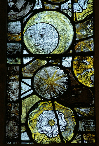
Chedworth in Gloucestershire
He says it's circa 1460's or 70's
also
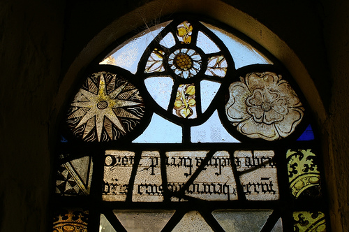
Aldsworth in Gloucestershire
October 21, 2006
Sendak Pop Up Book
Simply put, this is the most amazing work of art I've seen recently -
Make sure to check out the in process working drawings and paper constructions and the interview with the paper engineer, Matthew Reinhart and then -> some more in process pictures.
October 06, 2006
SG and Design
from the blog 'found type, print and stuff'
The association of SG with religious themes is to be expected, even if it can be a bit of a tiresome stereotype. The particular choice of the 'English Jumble style' is interesting in that it really does lend itself well to pattern design.
From the Penguin Poets series
cover designed by Stephen Russ

September 26, 2006
Yet more Flickring
Flickr continues to amaze. The stained glass tags now number more than 38,000. If anything this is too many to browse through, so now there are groups that feature more specific images of stained glass. This nice, enigmatic detail is from the windows at Fairford Cathedral and was featured in the "English Glass - Pre-Victorian" Group.
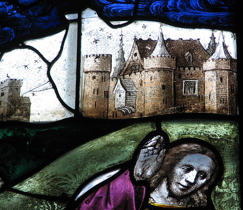
August 26, 2006
Flickring sign
While I'm trying to get everything into the new studio (one more weekend?!) I came across this on Flickr. I'll just take it as a sign in the midst of difficult times...
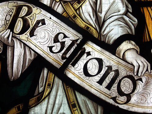
Flickr now has a group for 'stained glass'. I may join when things settle down a bit. I am surprised to see that there are already over 500 members. The photos certainly present lots of good stuff for your basic stained glass junkie, especially all the details. Yum.
June 02, 2006
The Secret of Drawing
Imagine - a tv documentary series about drawing.
The Secret of Drawing has been getting some buzz on the internet. It was broadcast in the UK in the fall of 2005 and has apparently been making the rounds via the internet. My setup is too low tech to access the whole program (wherever it is) and it has not made it's way in any other form to the USA, to my knowledge. But I would like to see the whole thing.
I was able to see this
Have I mentioned lately that I believe that a strong discipline in drawing is very important to any artist... I admit it, I am something of a drawing zealot.
Speaking of which, the website for 'The Secret of Drawing' also has a link to a group called CamDraw - The Campaign for Drawing. I checked them out briefly. It's a great idea and they look very earnest and they look very eccentric - leave it to the Brits...
February 23, 2006
Da Vinci Drawings
My polemic for the day - I think every stained glass artist needs to have a good solid background in drawing. For that matter, I think everyone could benefit from exposure to drawing at an early age, as a fundamental means of knowing the world. I believe it to be as important to learning as reading, writing and arithmetic. By this I mean drawing not simply as artistic rendering, but as communication, scientific description and social understanding. If you're interested in this concept of drawing you couldn't start anywhere better than the drawings of Leonardo DaVinci. Simply the best of the best.
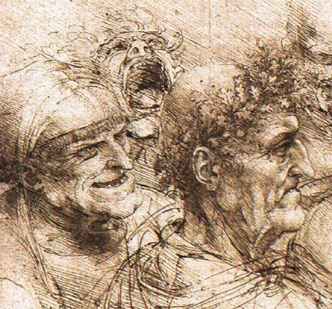
detail from "Five Characters in a Comic Scene"
link via Drawn!
August 08, 2005
more on Flickr
More on the photo sharing community phenomenon known as Flickr. I looked recently at the pool of images tagged with 'stained glass' - currently there are more than 2,600 images! Even if two thirds of those are of little or no interest (and many have no stained glass whatsoever), that leaves more than 800 images of stained glass that are of some interest. From looking for less than an hour it's clear that there is much to see for those interested in the design of stained glass windows.
from the curious -
from Ireland
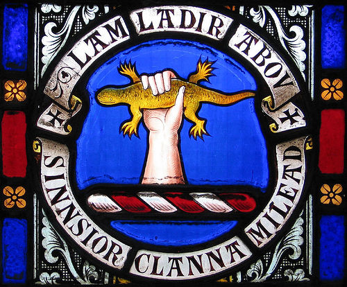
to the conventional -
in chicago?
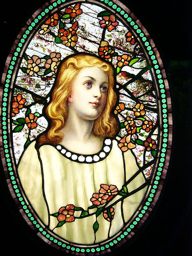
to the contemporary -
linz austria
July 04, 2005
"Yes, I need Tuesday"
Another interview with Maurice Sendak, this time on the Horn Book website from 2003, before Brundibar was published. I'm constantly surprised that with each new interview I read there is always something new, always something amazing.
June 18, 2005
Drawn!
Came upon this very good Illustration blog. With multiple contributors, this blog often has 2-3 entries a day. Good range of styles.
June 05, 2005
Poetry and Art site
at poets.org - a page that focuses on the mixture of poetry and art
Be warned, it is slightly maddening. The main 'poetry and art' page has few pictures and the pages they link to have few art samples on them - but many of those pages DO links then to some interesting sites.
I like this poetry with comics by Nick Flynn and Josh Neufeld.
May 02, 2005
Exercises in Style
Check out Exercises In Style, an experiment by Matt Madden where the same single page narrative is done over in 99 different sequential narrative styles. Funny and fascinating.
I keep thinking of this in terms of stained glass, and for two different reasons. In one, I've thought of adapting this same single page narrative into the sequential narrative style that is the Gothic stained glass window. I have it in my head and I'm not sure I have the drawing skill to pull it off. But I see it very clearly. He did do one of his pages in the style of the Bayeax Tapestry - close in terms of drawing style but not in the way the narrative would be laid out.
I also think in terms of how this might translate into different styles related to the design of a single stained glass panel. -Could it work at all when the 'content' of a design is often so abstracted or totally abstract? Could you take the same window dimension and the same 'subject' and apply different styles like this - one being a Tiffany window, another a Frank Lloyd Wright, another a Harry Clarke, another a Wilhelmina Geddes, another a Johannes Schreiter, etc? Is it possible? Just curious.
April 29, 2005
squaredcircle

saw this at design observer -
Here's the general article about the photo sharing website, Flickr. Then, the 'Group Photo pool' known as squaredcircle. This is pretty amazing. There are, as I write, more than 12,600 photos tagged as 'squaredcircle' in Flickr. This is the first time I am tempted to join in to some thing like this. I'd like to put some cropped photos of rose window images in there. I've already seen one image from a stained glass window, though it's just a close up detail of a standard off-the-shelf jewel in a panel.
April 17, 2005
Sendak in NYC
Recently called to my attention - an article on Maurice Sendak in the New York Times on a show at the Jewish Museum in NYC. With luck I'll be able to see the show. I have seen a few other shows with Sendak's artwork. I went to the Morgan Library some years ago and saw artwork for the book Dear Mili. Really amazing though I liked the simple storyboard drawings better then the ornate detailed final artwork. I have been to the Rosenbach Library, which is the offical repository for his artwork. This was years ago and they did not have much on display. Still, the musem is a very good small treasure. I hope it still retains its small museum charm with the recent expansion.
March 27, 2005
Judith Schaechter with context
There are images of new work by Judith Schaechter up at Parables in Glass. For me, the key issue with Judith Schaechter as a stained glass artist is context. Compared to most stained glass design today, her work is weird or shocking. But I contend that her work is only shocking in the context of it being stained glass. If it is seen in what is the more proper context of late 20th century graphic imagery, especially that which is categorized as 'underground comics' or 'lowbrow art' or 'outsider art', her work fits right in.
Look at the work of artists such as Robert Williams or Joe Coleman. The painting by Coleman, I am Joe's Fear of Disease, is especially striking, if pretty disturbing.
The more commercially accessible versions might be Gary Panter or Charles Burns.
Many stained glass artist don't know what to make of Scheachter's work. It seems so strange and wierd. I've never seen it as weird at all. Just reflective of a part of the culture that most stained glass artists are not involved with.
One creepy thing for me seeing her recent work is to see the dream balloon pieces. Not because the images are creepy - quite the opposite, they are some of her least brutal, almost sweet, images. The creepiness comes from the fact that I was designing 'dream balloon' panels at about the same time (starting in 2002, I believe), none of which I've yet made into panels yet. I suppose I got the idea from some of the early work of Art Spiegelman, who often played with the convention of word and thought balloons.
March 26, 2005
The Comics Thing, pt 1
Good online press for the comics world.
There is a multiple article issue on Art Spiegelman in Indy Magazine Winter 2005.
Also, there is a week long series on Robert Crumb at the Guardian website.
In both, there are lots of pictures and lots of background text. The comics art of the past 30-40 years has not had much of an impact on stained glass, with the primary exception of Judith Schaechter.... more on that tomorrow...
February 01, 2005
More book design blogstuff
This from the book design blog foreword, pointing to a site devoted to book covers found in the NY Times Book Review - called appropriately enough - Book Covers from the NY Times Book Review. Also featuring quick and snarky comments about those covers. By turns funny, interesting, picky and prickly, but not mean spirited.
Stained Glass artists could never get away with this.
Sometimes I wonder what it would be like if they tried.
