June 29, 2009
Cafe Gandolfi and the Flock of Fishes
A nice simple video about the commission "Flock of Fishes" for the Cafe Gandolfi in Glasgow, Scotland, with stained glass by John K Clark. "Flock of Fishes" is an early work by Clark, dated 1984-1987, but it's one of his most famous and popular despite his numerous successful commissions since then. I've been to the Cafe Gandolfi and can personally attest that it's a wonderful place and the 'fishes' is a wonderful work of stained glass.
I wish there were more videos like this on YouTube. Telling the story behind a stained glass commission, using simple narration by the artist.
Most videos on YouTube having to do with stained glass are so bad, with cheesy music, no information, and just bad filmmaking all around.
Lesson for today - keep it simple and informative.
February 09, 2009
Siegfried Reinhardt at Second Baptist
On some of SG forums recently, Barbara Krueger posted some links related to the Sanctuary of the Beatitudes windows at Second Baptist Church, in St. Louis, MO. She also posted a link to my flickrset - Siegfried Reinhardt Stained Glass - Second Baptist. It reminded me that I've been sitting on these images without doing a real blog post about it, for something like 4 years. So, I'll just post it briefly, and now.
What is it that I like about these? The scale of the figures is what strikes me first. The Christ figure is a good forty feet high (okay, at least 30, I'll check on that one). Many of the feet in the figures are a good three feet wide. In general, there is a much greater sense of caricature than is usual in stained glass and I like that.
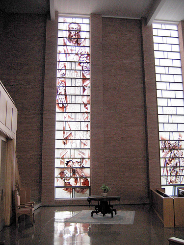
The glass is all clear seedy antique, no muted tints, all clear and much of it is extra seedy. One of the aspects I like most, which you have to look carefully to see in the photos, is how Reinhardt used cool grey areas of paint in the background and contrasted it in the figures with a red/brown warm paint, so it's not entirely monochromatic.
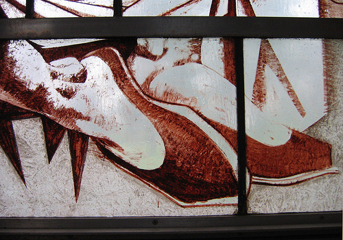
feet from the Fourth Beatitude - 'Blessed are they which do hunger and thirst after righteousness for they shall be filled'.
Siegfried Reinhardt passed away in 1984, but is still a well known artist in St. Louis. He's best known for the St. Louis Lambert Airport Murals depicting the history of aviation (scroll a little more than halfway down the page). In my opinion, it's in a more conservative style, compared to the Second Baptist windows. I like the Second Baptist style better, personally.
I hope to be adding onto this post in the next few days some of the close-up photos I took of the aviation mural, if they haven't gotten lost in the shuffle when I moved into my new studio 2½ years ago.
In the meantime, check out this LIFE magazine photo shoot of Reinhardt, from 1952 when Reinhardt was 26. It's the whole photo shoot, a full 75 images by photographer Howard Sochurek. I am curious to know what kind of article, if any, went with the pictures.
December 04, 2008
Malcolm Miller at Chartres
Bits and pieces on Malcom Miller, the English Guide at Chartres Cathedral since the 1950's, and still going strong as of October, 2008 (and here). First, via a French Journal blog entry, a Globe & Mail article from last March called Decoding the windows at Chartres.
Now a short video of one of his classic bits, the audience participatory flying buttress demo. My guess is that this is from the early 80's -
Miller tends to illicit a love him or hate him response. Academics don't much like him, and some tourists don't like him because he can be brusque and arrogant. I find his manner prickly but I like some of his ideas, particularly the emphasis on the windows as narrative.
I know that some academics criticize him for emphasizing the 'Cathedral as library' idea that he touts so enthusiastically. I think the point scholars are trying to make is that there is no way to prove historically that the stained glass in Chartres or any other Cathedral was used as a teaching or storytelling tool.
Still, I've never quite understood why scholars tend to downplay the narrative aspects of the windows. It's so obvious, and so unique. I've covered this sequential narrative aspect of Gothic stained glass in blog posts before - in The Comics Thing and Hypertexting the Gothic Cathedral. I would highly recommend Stuart Whatling's Corpus Narratologica site if you're interested in narrative in medieval stained glass.
Malcolm Miller goes into this narrative aspect in a 2001 NPR radio interview, from the program 'All Things Considered' - Chartres Cathedral on NPR. One narrative window he discusses, the Good Samaritan window, is the window I heard him 'read' when I saw him at Chartres in 1985.
May 26, 2008
St. Bartholomew War Memorial Window
This is the War Memorial Window in St. Bartholomew's Anglican Church, Ottawa, Canada, by the Irish stained glass artist Wilhelmina Geddes.
On the page for the Registry of Stained Glass Windows in Canada 'Featured Windows', you can download a very good article (pdf) from Irish Arts Review 1994 by Shirley Ann Brown. This article gives the best and most complete story of the commission.
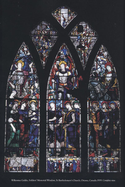
no photographer credited
photos are from the Irish Arts Review pdf, unless otherwise noted.
I could find no general biography of Geddes on the web, except for a few behind academic curtain walls. This was her only North American Commission.
I saw this window nearly 20 years ago while attending an animation festival in Ottawa and I've been trying to describe it to friends and colleagues ever since.
Unfortunately, I took only a few slides of the window, all details. I was stunned by it then and the images still resonate with me now. The initial emotional impact is strong and the sense of richness and depth in the details makes it a window that you can mull over for a very long time.
St. Bartholomew's is a small parish church and while this window dominates the east wall, the bottom of the window is at eye level and almost all of the detail is clearly visible. As I recall, the figures are not life size. Neither the St. Bart's website nor the Irish Arts Review article lists the window's size.
The St. Bart's site has a nice writeup discussing the iconography of the window. This page also has an image that gives a better sense of scale.
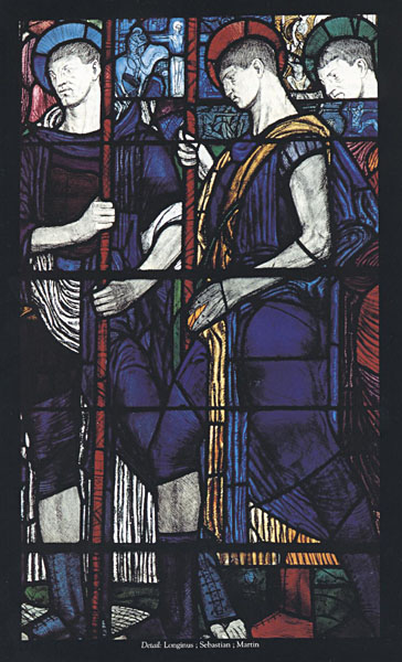
center lancet with the figures of Longinus, Sebastion and Martin
Three Figures in Each panel -
left lancet -
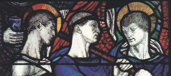
Raphael, Slain Warrior and Gabriel
Center lancet again closer
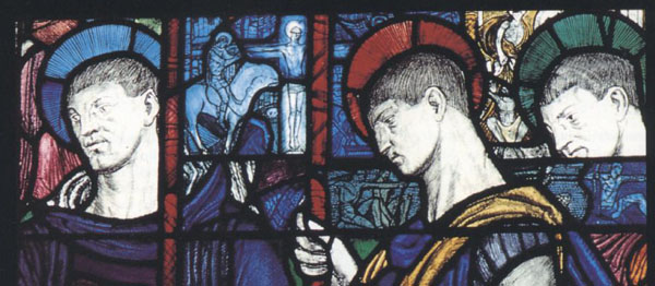
Longinus, Sebastion and Martin
Note all the small scenes happening behind and around the larger figures.
Right Lancet
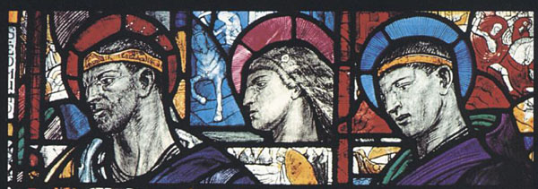
Edmund, Joan of Arc and Louis
Small details from the bottom most area of the panel -
these are my photographs from my visit in the late 80's.
from this section at the lower left
I like the rough expressive quality of the painting and etching.
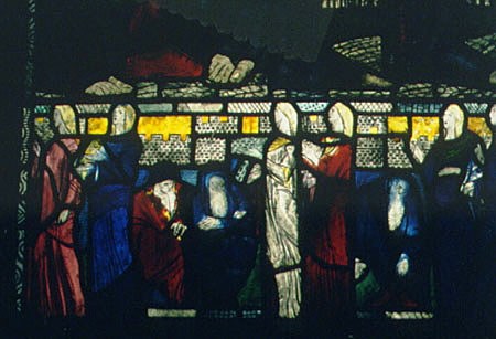
Just like me to focus on the mourners rather than the soldiers.
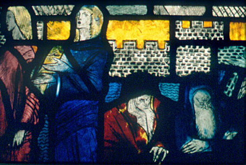
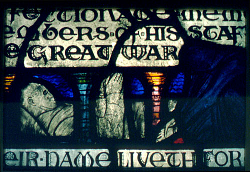
As much as I like this window, I've always had mixed feelings about war memorials. Just how do you honor the dead and those who served without honoring, and therefore perpetuating, the institution of war? Is such a thing possible?
So why then do I like this window so much? I may be reading into it or projecting my own views but I see this as expressing a more somber, as opposed to a reverential, view of war. Rough, sketchy, a bit chaotic, and certainly not sentimental. On reading the Irish Arts Review article, it would seem the window was criticized in its time, but there are no specific details given and I'm not sure if such criticism had to do with content or style - or both.
Any time I think of war memorials, this particular movie scene comes to mind - written by Paddy Chayevsky for the movie version of William Bradford Huie's "The Americanization of Emily". This is a quote from the movie, pure Paddy Chayevsy...
We shall never end wars, Mrs. Barham, by blaming it on ministers and generals, or warmongering imperialists, or all the other banal bogies. It's the rest of us who build statues to those generals and name boulevards after those ministers. The rest of us who make heroes of our dead and shrines of our battlefields. We wear our widows' weeds like nuns, Mrs. Barham, and perpetuate war by exalting its sacrifice.
It's a complex sentiment from a complex scene from a complex movie, especially when you consider it's a comedy. It's not anti-war, yet it is anti-reverence-for-war. You can see the whole scene in context on Youtube.
Finally - note that the leading expert on Wihelmina Geddes, Dr. Nicola Gordon Bowe, will be presenting a talk on Wilhelmina Geddes at the 2008 American Glass Guild Conference on August 2, 2008. I'm planning on being there and very much look forward to Dr. Bowe's presentation.
August 14, 2007
Open Studio - Alice L. Johnson
After participating in the St. Louis City-Wide Open Studios Weekend a few weeks ago, I've been thinking about all the artist studios I've visited as part of open studio events over the past 25+ years - especially in the 80's and into the 90's in Boston. I remember going to open studio events at places like Brickbottom, Vernon Street Studios, Fort Point Arts Community, and the Allston Arts District.
It also gave me the idea to try a web equivalent with an emphasis on stained glass artists. That is, catalogue visits to stained glass artists and their studios. Starting with the home studio of Alice Johnson in Watertown, Mass. I've known Alice for more that 20 years and count her as a great friend as well a one of the most talented stained glass artists I know.
This is the exterior of the house - with just a glimpse of the amazing garden that wraps around to the back.
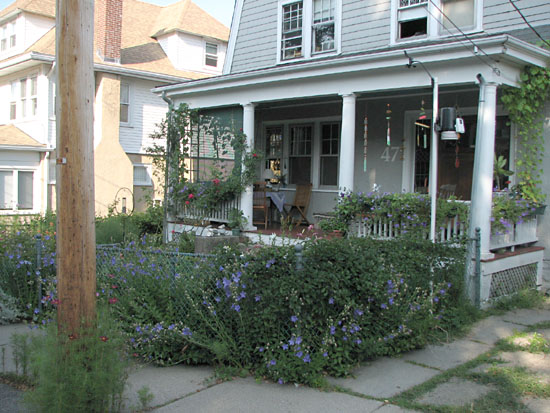
Design Studio
Alice and her husband Paul have lived in this house for almost 25 years.
Her design studio and stained glass studio are on the second floor.
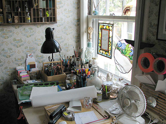
A view of the design studio as first seen coming up the stairs.
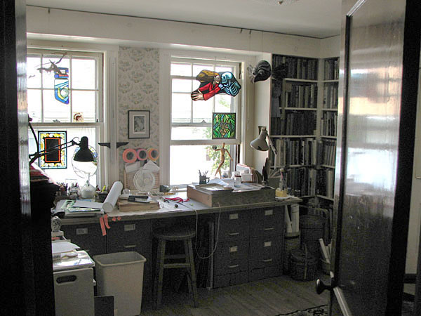
Drawing implements
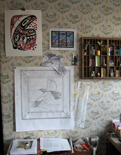
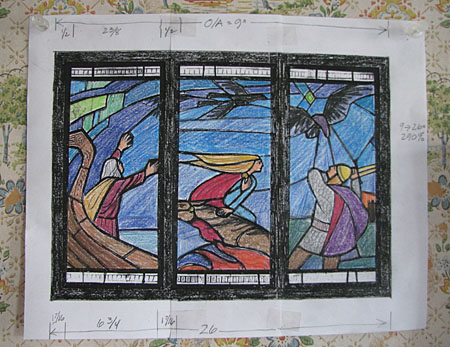
Designs on the side wall to the left.
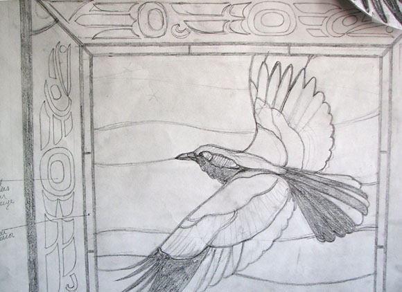
Close up of one design.
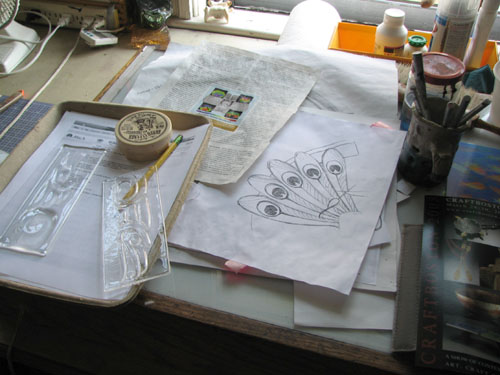
Note the two clear fused glass pieces on the left. These are experiments for the border on the design above.
Another sketch tacked up on the wall.
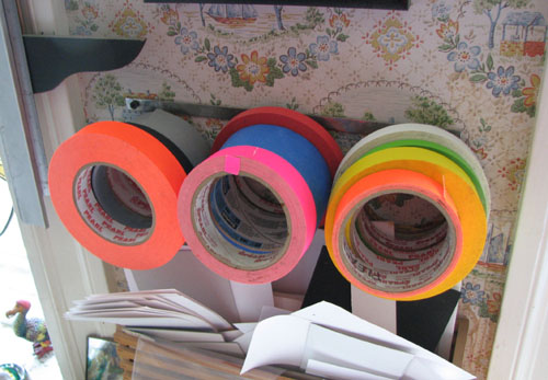
Colorful tape on a rack. Very useful stuff...
Small painted piece in the window of the design studio.
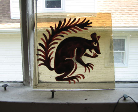
Alice tells me that the design for the 'Greedy Squirrel' is based on an element of a panel of St. John the Baptist that she saw at the Stained Glass Museum at Ely when she visited the Museum in 1991.
Another small panel in the window of the design studio -
Mirror with an improvised patchwork style border.
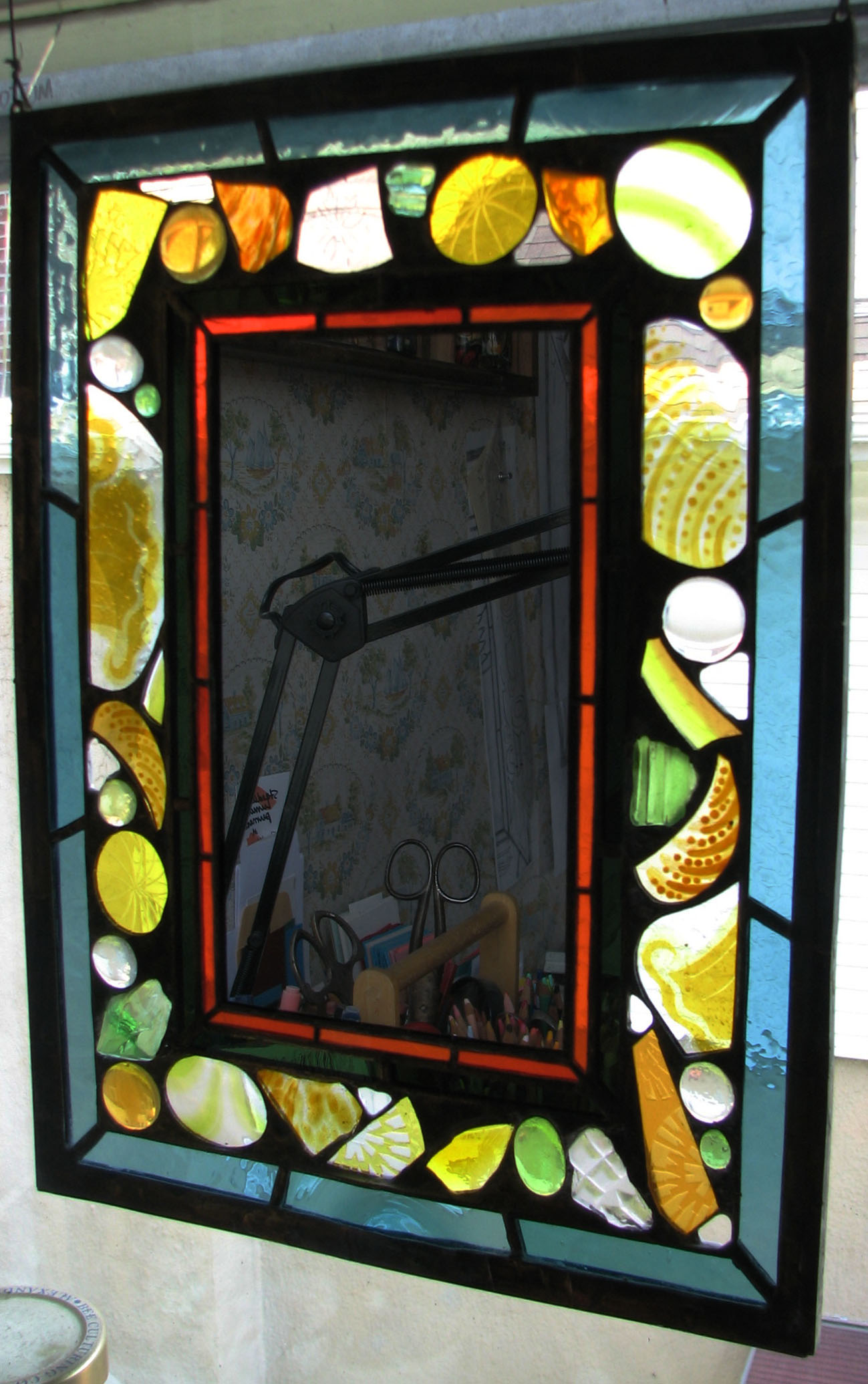
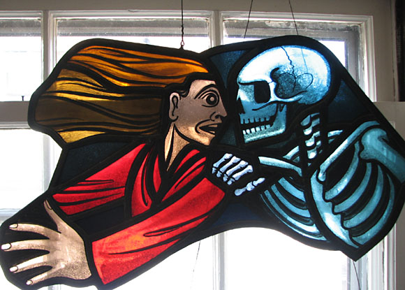
Death and the Maiden - one of Alice's earlier efforts
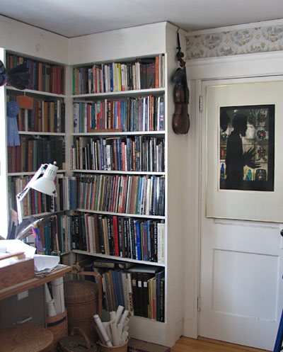
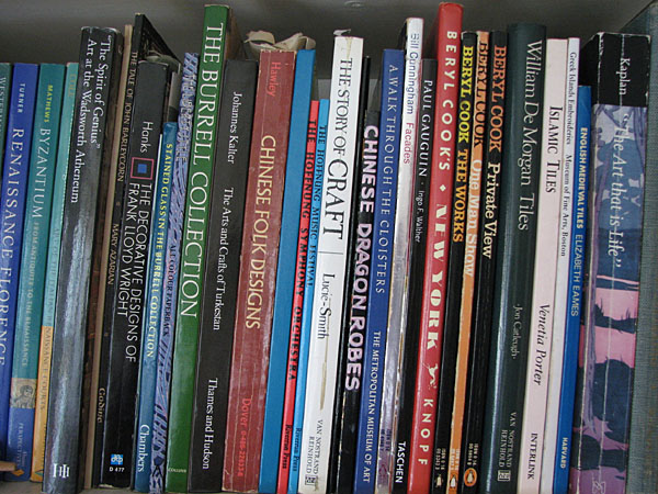
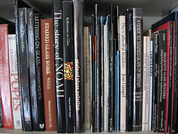
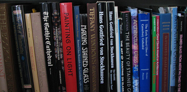
I can't help it, whenever I visit an artist's studio I hone in on the bookshelves. I think it immensely interesting to see what influences, tastes, and proclivities present themselves in seeing what books the artist keeps on hand. This is just a glimpse.
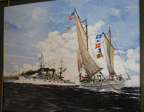
On the way out of the design studio and into the stained glass studio notice on the right a few paintings by Alice's father, Carl Lane, who specialized in marine scenes.
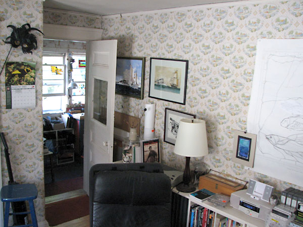
Stained Glass Studio
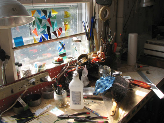
Small but efficient. The kiln seen here is her older kiln, used now only rarely. She has a larger and newer kiln in a corner of her basement.
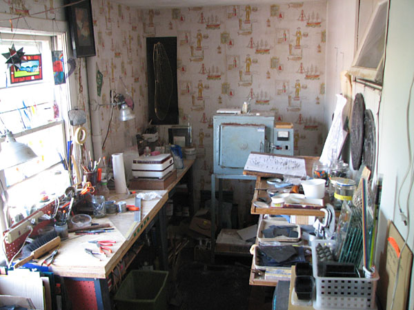
Closer views
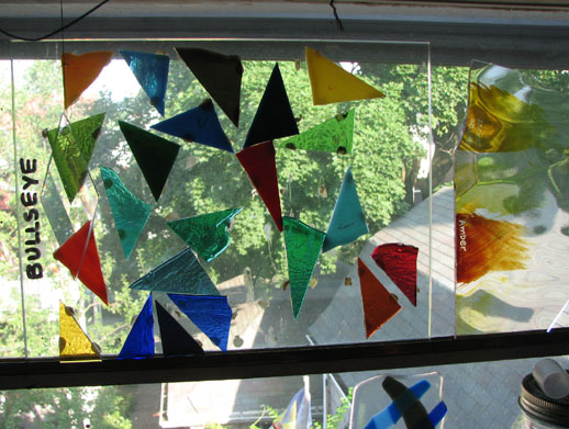
Samples in the window - Bullseye glass for fusing and some silverstain samples
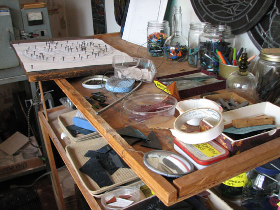
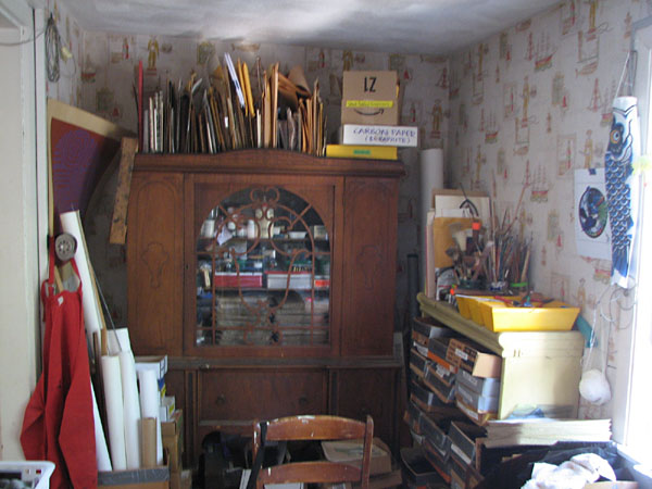
Turn around to the left and it's all pretty well packed in, and well organized.
These are trays holding an amazing variety of ready-to-use paint palettes. The trays themselves are old lunch trays from a cafeteria at M.I.T.
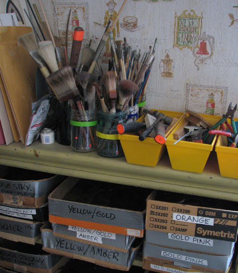
Showing Alice's brushes and a glimpse of some of the organized bins for small pieces of glass. Note the colorful tape put to use...
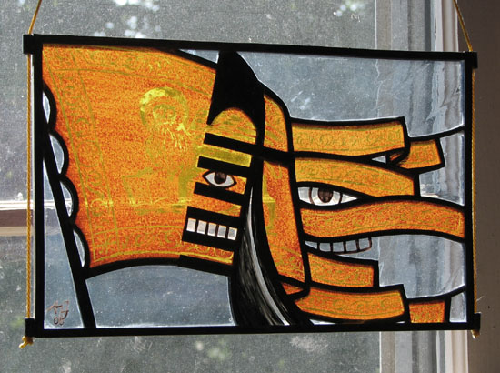
Exquisite Corpse section in the SG shop - there are at least a dozen more 'corpse' sections peppered throughout the house
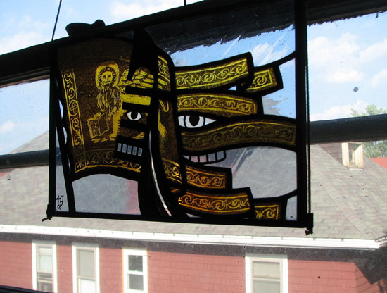
another angle showing the designs scratched into the stain.
Auxiliary SG Studio
Alice keeps her larger sheets of glass in this area of the basement. All the cutting and glazing goes on upstairs. The basement area is used for cutting down larger sheets to bring upstairs and for cementing panels.
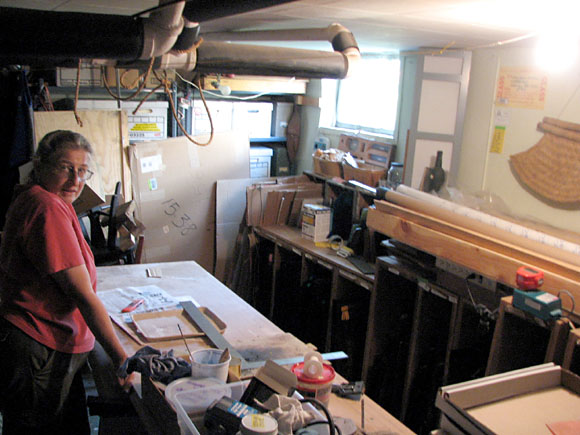
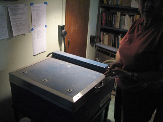
The basement is also where her primary kiln is located.
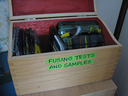
Recent work - Fusing/Painting
Alice has been playing around with fusing and with combining fusing with painting - with some very interesting results. She keeps her fusing samples and experiments well catalogued, providing yet another use for that colorful tape.
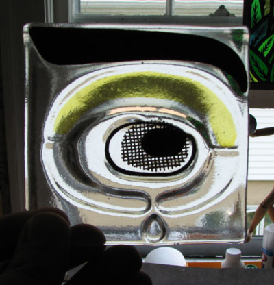
An example of one of her typical fusing/painting/staining experiments. The piece is fused with clear and black glass and wire mesh, then painted and stained as well.
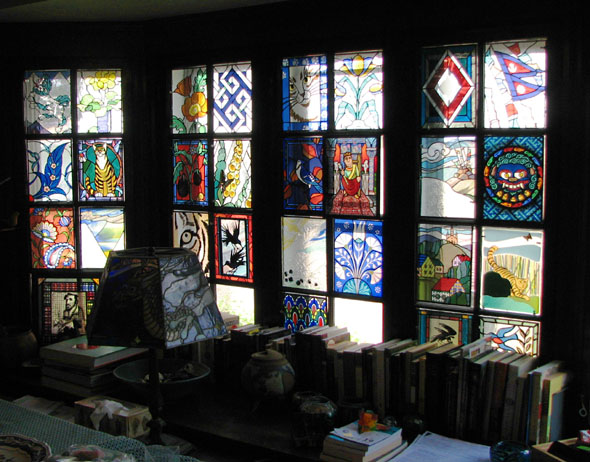
A new fused panel by Alice meant for her amazing, ever evolving Bay Window.
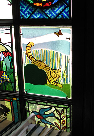
Cat and Butterfly fused/painted panel.
The Bay Window in its current manifestation. The Fused Cat panel is in the lower right corner.
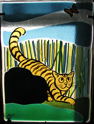
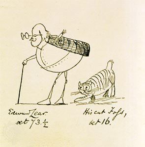
The design is roughly based on this drawing by Edward Lear of him and his cat, Foss. 'Roughly based' because, as you can see, Foss has a stubby tail and Alice's cat has a long tail. Alice and Paul have 2 tabby cats themselves.
Finally, thanks to Alice for opening her studio to my latest little experiment in citizen journalism.
March 24, 2006
Second Presbyterian Church, St. Louis
Finally had a chance to stop in and look at the windows at Second Presbyterian Church in St. Louis. Nice group of Tiffany windows - including this rather somber figure of 'Faith' -
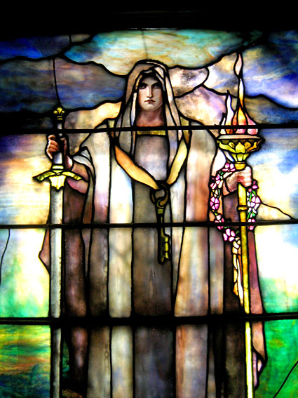
These Tiffany windows are more indicative of later Tiffany, with large areas of plated glass and small detailed areas using highly colored chunks of glass, such as the little wreath of flowers draped on the left hand. This church is going to be a part of the G.A.S. pre-Conference stained glass tour on June 14th.
August 28, 2005
Union Station
Finally got to Union Station in St. Louis to see the opalescent era window there. I'd heard it was a good one to seek out.
The initial view about the main doorway to the Hyatt.
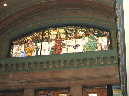
A straight-on view from the 2nd floor.
The figure on the left represents San Francisco, the figure on the right represents New York, and the figure in the center represents St. Louis.
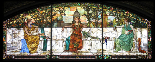
a closer view
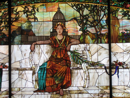
This window is apparently seen in the movie "Escape from New York". Part of the movie was filmed in Union station before its renovation.
July 12, 2005
Gilula at Shaare Emeth
There is a new public glass art sculpture, Eternal Light, in the lobby of Temple Shaare Emeth at Ladue and Ballas. Made by Aaron Frankel and Ian Gilula of Elements Glass, out of Portland, OR. Gilula grew up in St. Louis and is described as a protege of Dale Chihuly.
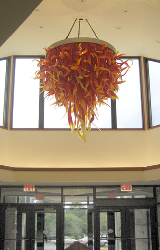
and a closer view
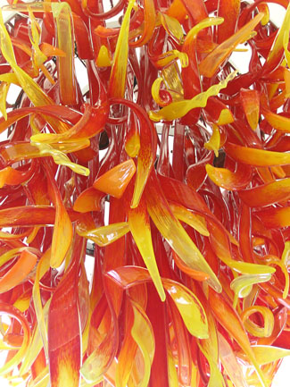
Shaare Emeth is also the home of Chihuly's first architectural commission for a public space.
June 10, 2005
Derix in St. Louis
Recently saw this window at the St. Louis Regional Arts Commission's Cultural Resource Center. Here is the full exterior night shot.
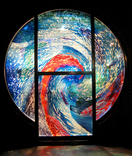
It's on the east side of the Regional Arts Commission building on Delmar in the U-City Loop in St. Louis. I must admit my first impression of this window was not positive. Granted that I had only seen it passing by in a vehicle, but I thought that it must be plastic or a cheesy non-permanent painting on glass. Basically, from a distance, this comes off as a very ordinary corporate style, status quo abstract design. (I'll try to get a daylight long shot to illustrate this...) Well, I happened to be walking past one night and got a close look at it from the outside. It's all glass and a pretty interesting piece for several reasons.
This is a closer view showing the text. The lines show the seperate pieces of glass.
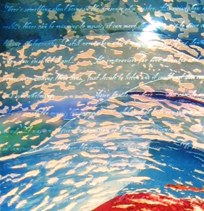
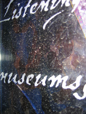
The piece is in at least three layers. The exterior layer is plate glass sandblasted with text that is not at all visible from a distance, and is barely legible up close. It's written in english, but with a hard to read cursive script. It may be more readable in daylight.
Very close at an angle to show the text most clearly.
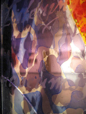
The color layers are flashed glass etched and cut and matched together in a kind of a tight puzzle. I assume it's put together with glue, though it could be fused together. The workmanship is very precise.
The details show some of the layering.
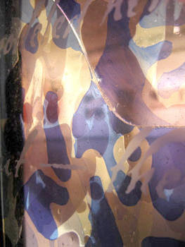
acid etched light blue and purple flashed glass - with what looks like some enamel painting, I believe.
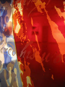
and a detail showing a more striking division of colors/glasses -
The artist is given as William M. Cochran, of Maryland. He apparently does mostly trompe l'oeil murals. The signature says it's made 'in cooperation with Derix Glasstudios'. Well, I certainly have heard of them and know they are in the forefront of developing experimental techniques on all kinds of architectural glass. Interesting that it's in St. Louis. I hear that a representative from Derix is speaking at the SGAA conference this coming month. It'll be curious to hear if this piece is mentioned.
May 21, 2005
St. Louis Cathedral Basilica Windows
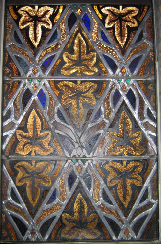
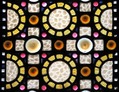
This from the Cathedral Basilica in St. Louis, most famous for its mosaics (41 million tesserae is the fugure used, I believe). The Basilica features some interesting decorative stained glass as well -- this is in a chapel on the left as you come in.
full window -
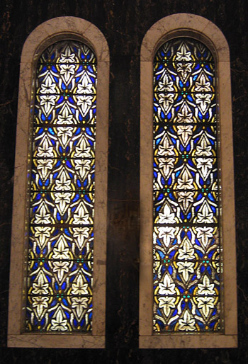
a closer look -
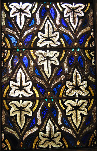
a closer look in reflected light -
there are also these that have lots of interesting old jewels - something I've been looking into recently - I'm looking into making some custom jewels
the full window -

a close up -
April 09, 2005
St Marks Episcopal, St. Louis
About a month ago I visited St. Mark's Episcopal, the first church in St. Louis to be built in the modern style. Basically, Art Deco design. Very striking. The windows were designed by Robert Harmon and made at the Frei studios of St. Louis in 1939.
All the windows are tall and narrow with a stylized image of Christ at the top leading down to different symbols for that particular window. The colors throughout feature this nearly monochromatic shift from white to lavender to variations of middle blue. A very difficult range of colors to make work with - and here it works very well.
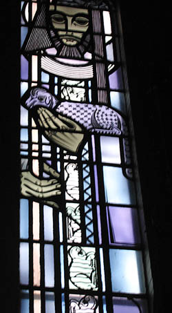
The image at the bottom of this window is something of an in joke - as the architects were named Dunn and Nagel, German for hammer and nail. The theme for the window is 'cooperatively working together'.
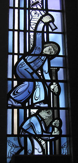
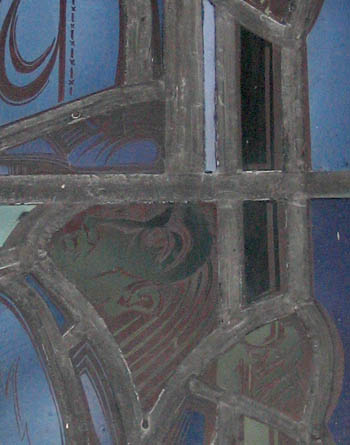
The leads are wide. The vertical lead in the upper center area of the photograph is about 1.5" wide. The majority are about 3/4" wide. Much wider than usual for stained glass. If you look closely you'll see this is the head and hand of the figure at the bottom of the Dunn and Nagel window holding the nail.
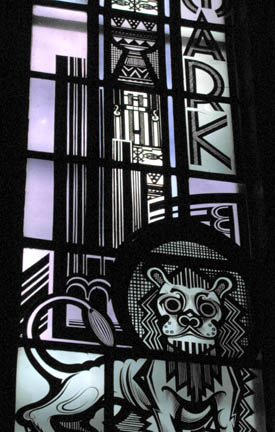
A deco lion, symbol of St. Mark.
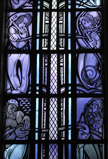
There is a strong element of social justice in these windows. The one below is sited most often with its references to labor exploitation and racial prejudice. Highly unusual in stained glass.
March 21, 2005
St Francis Xavier (College) Church
Quick look today inside St. Francis Xavier (College) Church, at St. Louis University.
All the windows are by the Emil Frei studio, out of St. Louis, done in the 1930s. The windows are a straightforward gothic revival (american version) style, with mostly standard figural scenes. The tone of them almost suggests grisaille, for there is a good amount of white. The main exception being the large piece behind the altar, which is in bright vivid primary colors, almost coming off as abstraction from a distance. That one was impossible for me to photograph.
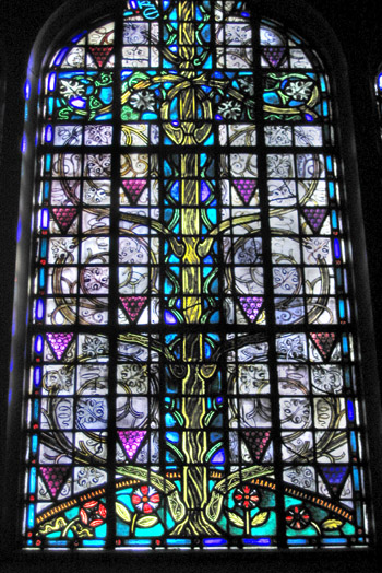
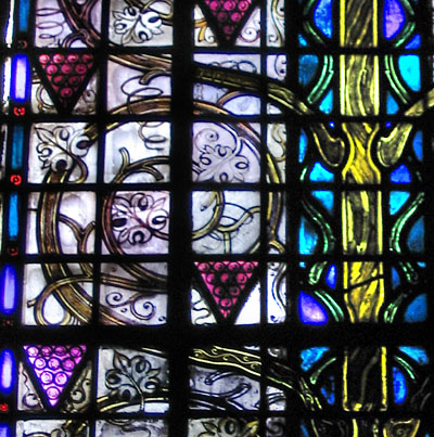
The most interesting windows were tucked in out of sight in the transcepts. One is this tree window which has in interesting mix of painted grisaille (the vines and leaves) and standard mosaic style (tree trunk and grapes). This is in the South transept, facing the altar.
This detail shows the grisaille vines and leaves better.
This is in the North transept, facing the altar.
Offhand, I like this one the best in the whole church.
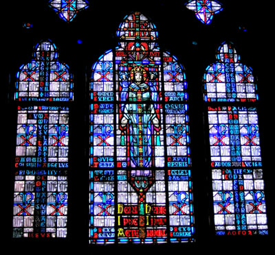
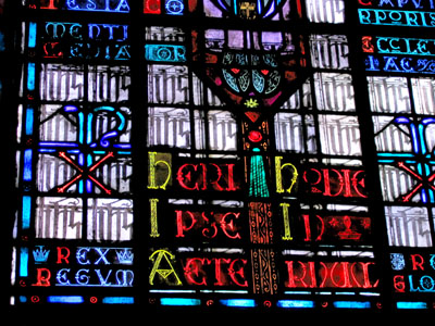
Looked at more closely this looks to be all text, albeit with a lot of repetition. I like this idea. Not sure what that main character set in the quarries says.
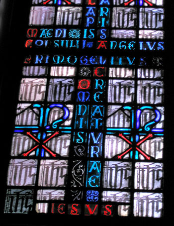
I can't help but think - what if this featured all readable text - wouldn't it increase the interest of the window as a whole? Is it simply a matter of making it in English rather than Latin? But I'm not sure I'm even catching what the Latin words are most of the time. Funny how this is an issue that this artist shares with graffiti artists. Artistic style or readable content?
March 11, 2005
Christ Church Episcopal, Downtown St. Louis
Kind of choppy selection of windows here. There are some early Connick windows in a chapel (too far away to photograph), 2 small average-at-best Tiffany windows, and several (painted that are covered over by an attached building. The most interesting were two windows in a French Gothic style. Unsure about the studio.
The "Jesus enters Jerusalem" window in full -
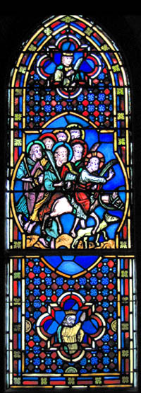
A detail of the lower section -
I have no idea who this figure is supposed to be.
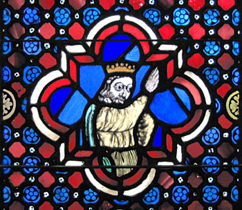
and a close up of the small figure -
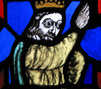
There are also a few windows in this style. Large pieces of glass, like the trim on the sash - all one long piece.
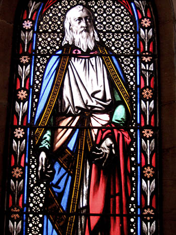
I like the face on this one, it could almost be a William Blake head.
March 04, 2005
Chihuly at Shaare Emeth
The temple we attend in St. Louis has these stained glass windows in the main chapel area. Contemporary style - very minimalist. I had seen some similar ones in photographs particularly in the early 90's, but I could not recognize the artist. These turn out to be earlier (late70's/early80's) and by none other than Dale Chihuly. Not at all like his more recent wild-style, anemone-like constructions being made for practically every museum on the continental US.
There is mention of the Shaare Emeth Commission on Chihily's website, though buried in the back in old installations. It turns out this installation is Chihuly's first installation for a public space!
Here are some pictures taken recently. These windows are extemely difficult to photograph. The contrast in light is extreme. When photographing, the window details get blown out very easily.
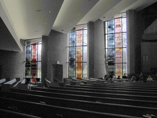
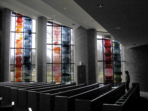
The glass is superior quality handblown flashed glass, with a good amount of gold pink flash. Each piece is acid etched. The red/pink and grey columns are symbols for the columns of smoke and fire that led the Isrealites in the desert.
This is the left side looking toward the Bima (central altar in a synagogue).
The right side looking toward the Bima.
A closer shot of the panels on the farthest right.
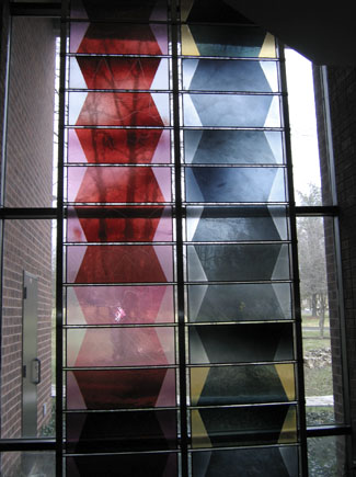
A even closer shot of the window on the farthest right,
where the pink is in between the red on rose pieces. These are at eye level.
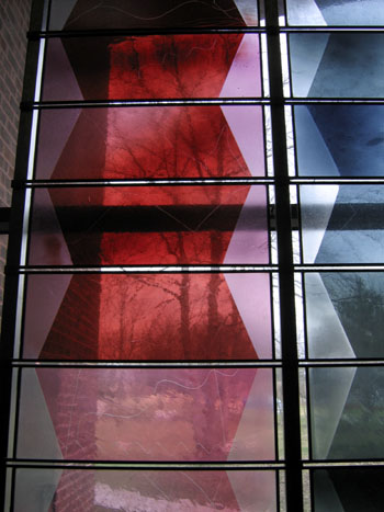
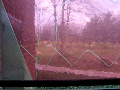
and a close up showing the lines etched away on that same panel.
Not all panels have this thin line etching.
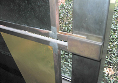
And this is a look at the metalwork. There are what appears to be brass channels holding each individual piece of glass.
[update april 29, 2005 - I just saw these windows for the first time in morning light and they come off much better. The unique quality of the handblown glass shows up much much better with the indirect light of the morning.]
February 28, 2005
Kirkwood First Presbyterian Glass
I'm going to try to document some of the glass I see over the next few months in the St. Louis area, focusing on what makes an impression. Not necessarily what is the biggest or even the best, but what is of interest to me at the moment. The small corners and little details.
First up is Kirkwood First Presbyterian Church, right across from my local public library.
The large area of glass is above the altar.
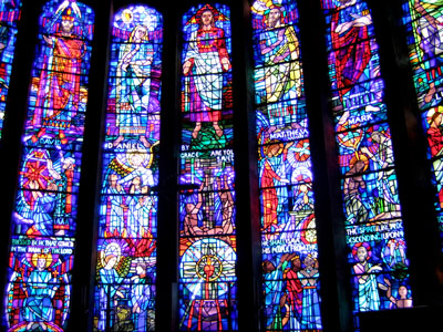
Bold black line painting, little or no tonal painting and bright primary colors.
The colors are a bit hot for my taste.
Still, I like the side aisle windows, small (about a sqaure foot each), each designating one christian symbol. There are a number of them along the wall on east wall. Of course, I always like the little panels best...
I especially like this rather languid looking ox with wings, a symbol for St. Luke - 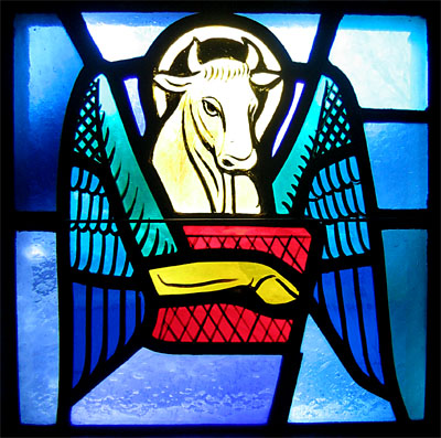
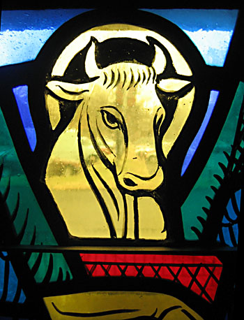
and a detail
December 24, 2004
Happy Christmas
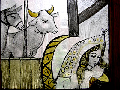
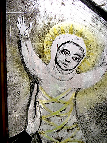
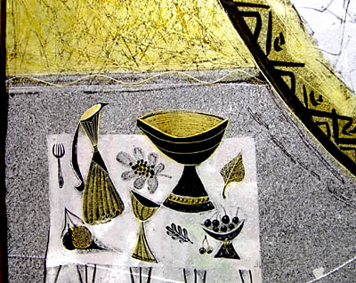
I just came across these photos I shot this past summer - they seem appropriate for the Christmas season. They are more from the Windows at Webster University - these are opposite the ones I posted about in July.
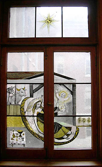
and some details
December 14, 2004
Temple Beth El
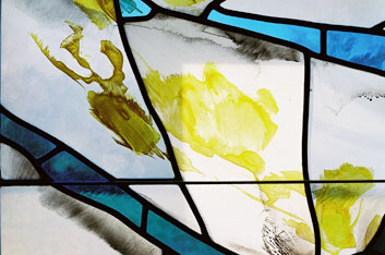
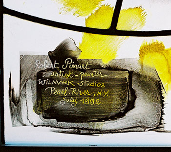
While in Charlotte just in the past 2 weeks, I had a chance to take a few pictures of the windows at the Temple we attended when we lived in Charlotte. Robert Pinart designed and Wilmark studios fabricated the windows in 1992. I believe this is the 'Creation' window. It's in the Gold Chapel.
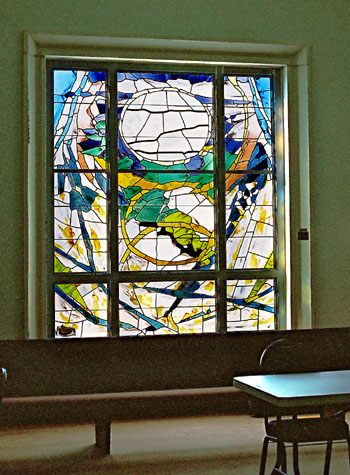
one detail - I like the use of silver stain as washes of color and texture.
signature by Pinart
July 20, 2004
Windows at Webster
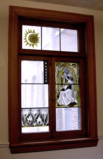
Saw these unusual windows in Webster Hall at Webster University in St. Louis, Missouri. The windows consist of just the nine pieces of handblown seeded clear glass painted and stained. The stylization is very much in keeping with illustration of the 50's and 60's. Unfortunately, they are unsigned and I didn't have the time to ask for further info.
The full window -
and a detail
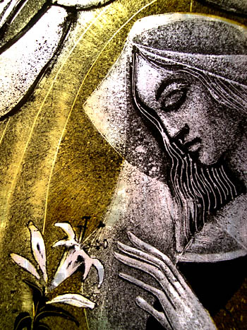
and another detail -
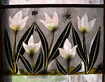
There are 3 others similar to this, but the photos came out best on this one.
June 17, 2004
Seen in St. Louis
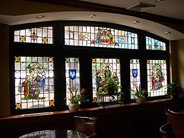
Saw this recently in the dining room of the Mayfair Hotel in St. Louis. Nice windows throughout the room. A pleasant illustrative style. Made in the 1920's though the artist and maker are unknown. Any ideas?
[update December 1, 2009 - The studio that did the Mayfair windows was the Jacoby Art Glass Studio, in St. Louis. Jacoby's went out of business in the 1970's, but there is a nice webpage about the History of the Jacoby Art Glass Studio online. The information is a bit of a jumble, but according to this site, the Mayfair windows were designed by Lee Cook, though no date is mentioned. The hotel opened in 1925.
Also related to the Mayfair SG, I posted a Mayfair Hotel Dining Room Stained Glass Flickrset a few months ago. 25 photos, lots of details]
Here is a shot of the panels in one room - with the theme of 'Courtship'.
and here is a detail of the panel on the farthest right.
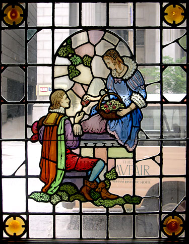
A nice sweet style.
----------
This panel is from the other room where the theme is apparently still courtship, though the emphasis is more on revelry. This panel is probably my favorite of the whole group. The figure is a bit bigger than the others and I like the quality of the linework and the brighter color.

April 23, 2004
The English jumble thing
Courtesy of the Stained Glass Network ListServ, this link to a website for Corpus Vitrearum in Britain (listed by location) - Lots and lots of pictures of British Medieval and Renaissance stained glass. From York Minster to Canterbury Cathedral and many many small parish churches, there seems to be literally thousands of images to see. Quite amazing.
This does make a good place to mention my fascination with what I refer to as the "English Jumble Window".
This is a uniquely British phenomenon of stained glass where a window has been willfully destroyed (most likely by the Puritans), but some of the pieces survive and it's reassembled. That is, at a later date, someone reglazes the glass pieces into a new stained glass panel. This is done in a manner that more or less preserves the general composition but throws in old bits of other windows, clear glass or whatever-can-be-found to fill the gaps. The degree of 'jumbling' varies widely. The result is a window that, on first glance, looks like an old stained glass window with a bit of repair done. On closer examination it can seem like Cubism had its true origin in British stained glass.
A specific example - one that I actually saw myself on a trip to the Lakes District, when I visited a small parish church named Cartmel Fell in 1991. The guidebook called the East Chancel Window something like 'one of the finest and most complete examples of 15th century English stained glass". I was struck by the fact that perhaps only 20-30 percent of the original window was actually there in front of me, vaguely discernable in its composition. And I liked it. The appeal for me came partly in the detective/puzzle work of figuring out what the original scene looked like and partly a vague curiousity/fascination with the jumble itself.
East Chancel Window, Cartmel Fell
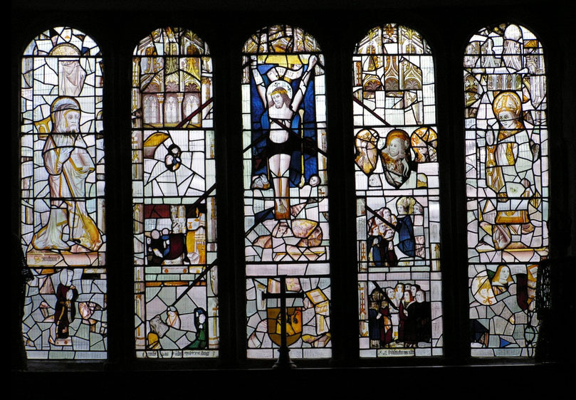
photo via davelynne - click for larger image
I have a sneaking suspicion that I might even like the jumble window better than the original window, though that's hard to prove. I just find the jumble panels to be intrinsically appealing.
My own patchwork panels are very much influenced by these English jumble panels. The patchwork panels have no pre-set design. Each panel is designed with the glass itself, using old test pieces, extras from old panels, and stock pieces of painted and etched glass. The process is one of improvisation. Sometimes it works, sometimes not. But it's never predictable.
And I like that.
[update May 18, 2009 - new better photo of the Cartmel Fell window and additonal info if you check out the page of Flickrite davelynne]